Note:1. This article includes spoiler content.2. The screenshots of the motion picture are only for the explanation of composition rules. No copyright infringement intended.
Although motion pictures and photographs are completely different seemingly, they do share some similarities. Composition rules are one of the examples. A friend of mine recommended me the movie The Grand Budapest Hotel (2014) recently. Not long after, I found the movie on an in-flight entertainment system. I watched it during the flight and this comedy film is exceptionally impressive and amusing. It is the story of the fictional Grand Budapest Hotel and the adventure of Gustave, the legendary concierge of the hotel, and the lobby boy Zero Moustafa. Despite the relatively complicated plot, Wes Anderson, the director of the motion picture, still managed to present the story and details clearly. To me, the most heart-captivating part of the movie are the perfect and neat compositions, though. In the following paragraphs, I hope to give you some insights on the compositions used in the movie.
Table of Contents
This is undoubtedly the most well-known composition rule in photography. It is applicable in cinematography too. Not surprisingly, this type composition is also commonly seen in The Grand Budapest Hotel. Rule of thirds is a simplified version of golden ratio composition. Pictures shot with the approach of the rule of thirds are generally more appealing to eyes. The following screenshots are some of the examples. The subjects are being positioned to the guidelines or the intersections of the rule of thirds. Furthermore, the following shots are probably captured with telephoto lenses, which will bring strong compaction to pictures. If you were a newbie to photography, you may attempt the approach of the rule of thirds as it usually gives decent results.
The philosophy of diagonal composition is to let a diagonal line run through the frame. The diagonal line may not be actually a line. It could be a river, a railway track or a pathway. The diagonal line acts as a guide for directions to the audiences.
The illustration above shows the concept of diagonal composition. The diagonal lines of a square are 45 degrees, obviously. However, the common aspect ratio of DSLR photo is 3:2, which is rectangular in shape. Therefore, we could divide a 3:2 photo into three equal parts, and you may consider the three equal parts as two overlapped squares (i.e. the red and the blue one). Then we are able to obtain diagonal lines of 45 degrees of the two squares. The subject may be positioned to one of the vertical lines while the guiding object such as a pathway may be placed on one of the diagonal lines next to the subject for directing audiences towards or away from the subject.
Indeed, the angle of the diagonal lines may vary according to the given aspect ratio of the picture. Even in the movie The Grand Budapest Hotel, some of the diagonal lines have an angle less than 45 degrees.
Centered composition is considered as an elementary skill by numerous photographers as it is a hot pick by laymen and beginners. Most of the amateur photographers hate this composition. In my humble opinion, centered composition works great with minimalism. It also works like a charm in architecture and fine art photography. Take the first screenshot below as an example. Centered composition highlighted the symmetry of the building interior. Gustave was calling for help in a payphone after escaping from the prison in the second screenshot. In fact, centered composition and rule of thirds are being incorporated into this single shot. The payphone, which is the subject in this scene, was placed in the middle of the frame, while the snowfield is aligned to the guideline of the rule of thirds. Centered composition gave a sense of simplicity while the rule of thirds composition of the snowfield and the sky added an appealing balance to the shot.
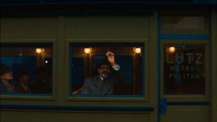
Technically, it may not be considered as a composition rule. It is worth mentioning, though. The scene below is one of the most brilliant scenes in terms of composition. Jopling was chasing Kovacs, who was the lawyer that was in charge in the matter of heritage and will, and Kovacs was later killed by Jopling. The scene started with Kovacs getting aboard on a tram. He lowered the blind at a window next to his seat. The cameraman kept shooting the window from the outside. Suddenly, a reflection of Jopling appears on the window. Kovacs was shocked and raised the blind to confirm if that was Jopling. This is a single shot scene if I remember correctly and the director managed to tell the story of this scene without switching to another camera. This is simply amazing.
Use of reflections is also commonly found in photography. You may experiment with reflections but put your subject into the area of the reflection. The subject will look more subtle and catch the attention of the audiences.
Comments (0)
There are no comments yet.