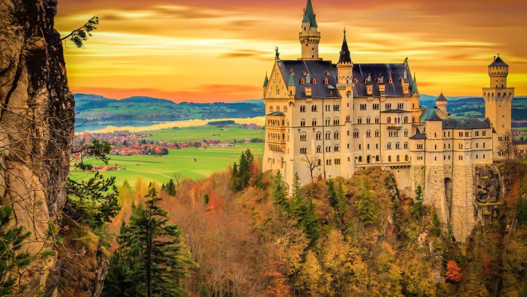
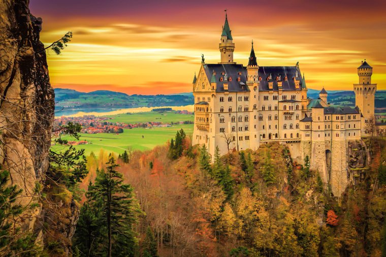
Hi everyone, so today we’re going to be taken a lot at this Image below for our Lightroom Tutorial. We’ll show you how to use the Lightroom Presets to give your architecture a deep rich feel.
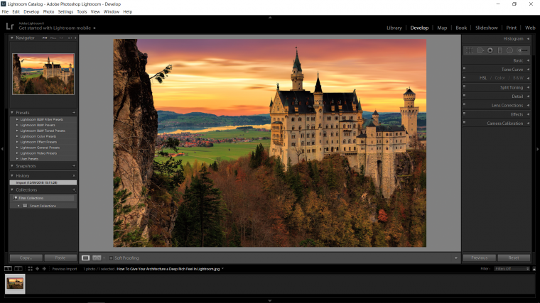
So assessing this image you can see that it is a great shot, but I feel that it is somewhat flat and that we can improve it by adding in some Deep Richness into it.
So let’s begin and see what we can do to improve this already wonderful image by using Lightroom presets! Who knows we might even edit it like Luizclas in Instagram.

The first thing I’m going to do is go to the Basic Panel on the right and to move the Temp slider up +10, so depending on the image you choose it will either be a cooler image, so more blue green or a warm image, mine is warm so I move my slider to the right, cool would be to the left.
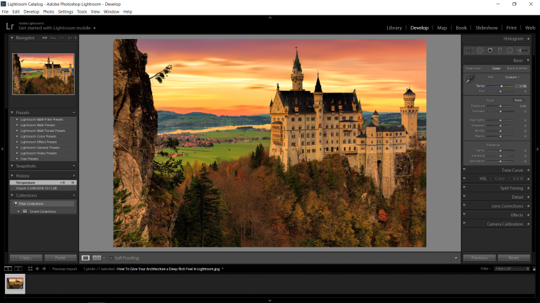
Next (and take note of this trick because we’ll be using it for a few of these sliders) is to hold Alt and then click on the slider, so this works for Exposure, when you do it your screen will turn black, so slider your slider until you see a load of pixels appear, then pull your slider back to the point when all the pixels disappear, at that point you will have perfect exposure.
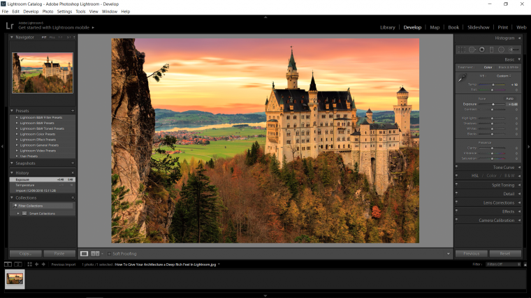
Next I’m just going to add +30 to the Contrast Slider to add in a little bit of that.
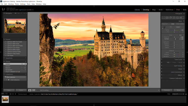
Next is when the main magic happens.
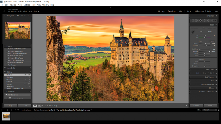
Slide the Highlights bar completely to the left and the Shadows bar all the way to the right, you will see a significant change already.
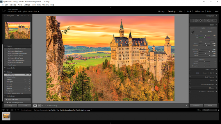
Now we are going to use the trick that we did with the exposure slider and we are going to apply that exact same principle to the Whites and Blacks slider. [Note: the Blacks screen will turn White so don’t freak out, you’re good]
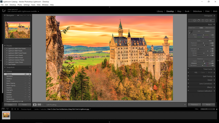
Next we’ll move just below that and add a little Clarity, just a touch should be enough.
Then Vibrance, but for the Vibrance you want to go as far as you can to the point of were it kind of looks bad, then just pull it back a slight bit, then with the Saturation below that you can then start to minus it off and drain a little bit of the color away.
Now we’ll start to play around with the individual colors, so with this scroll down to you see the HSL/Color/B&W tab, in there click on ‘All’
Now I’m going to go through every slider, with these I’m just going to do little slides, not huge changes, this will be a good exercise for you to think for yourself and see what you like in this process, so you’re on your own here to be free and creative, don’t worry so much, just trust your instinct, if you feel it doesn’t look for good and it’s making the image look pixelled then pull it back, use your best judgement.
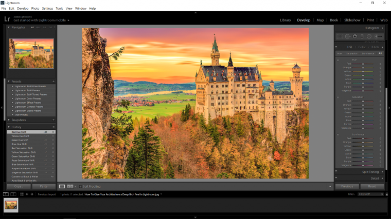

Now that we have the colors fixed up I’m going to move on to some of the Details, which is in the Detail panel.
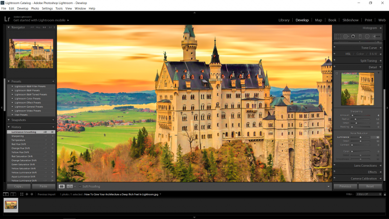
So the issue here is that with the Clarifying a little bit of Noise in the image was created, Noise is Pixellation, and more will be created now once we Sharpen, so I want to be able to sharpen so the image looks deeper but I don’t want any of the Pixellation, so the way around this is to of course first go to the slider in Sharpen called ‘Amount’ and just add a little bit to that, I moved my slider to 4.
Now the next step is to go to the panel below that which is your Noise Reduction and in that the slider that we use is called ‘Luminance’
Slide that to the right until you start to see the image becoming very soft and lacking in detail, then start to reverse until you get to the point when there is no pixellation.
Around 50 did it for me.
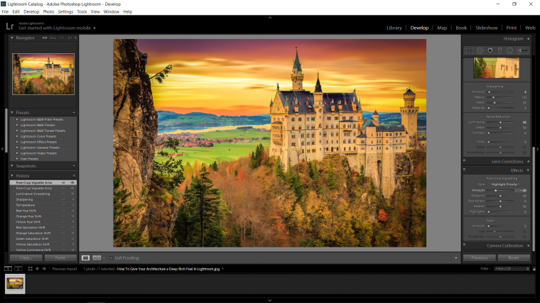
Last little touch let’s go to Effects, and add a -40 to the Amount which is the top slider there in the Post-Crop Vignetting, this will draw the eye in nicely towards the center of your image darkening the edges a little bit.
And with that we are done, your image should be looking awesome at this stage I hope and I hope you enjoyed what you learned and get to put it into use.
Comments (0)
There are no comments yet.