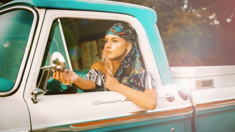
Hi all, welcome to another one of my Photoshop Tutorials, today I want to have a look at an Instagram Photographer I have recently started to follow by the name of Mark Singerman.
I have to say I really like his punchy style and it fits into the sort of editing I like to do for my Images personally.
btw if you are looking for best Photoshop Actions you can see it here
So if you haven’t already take a few minutes to go take a look at his style in your search engine.
The main goal of this tutorial will be to show you some of the techniques used, I don’t want you to copy me or the Photographer in question but to take these techniques and ideas and apply them to your own editing to see what you can come up with for yourself.
So don’t worry if you don’t get an amazing look right away, but more have fun and play around and see what you can achieve.
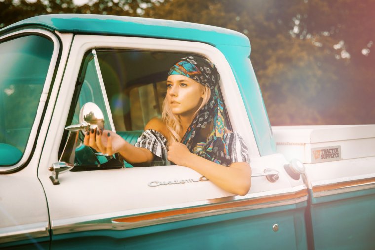
Let’s begin, so the type of image that I’m going to be using for this is a model shot as if I am editing this image for a fashion magazine or something, so get something similar.
Check out my image below.
So just on a side note, make it easy on yourself and get an image that already has a blue/orange to it because that’s the style we’re going after.
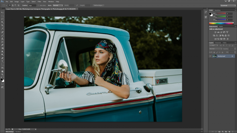
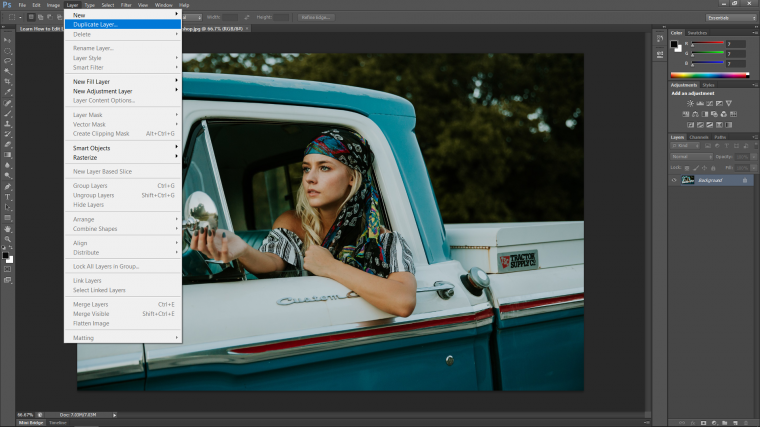
The first thing that we are going to do is to create a duplicate layer to work on so that we have the original layer safe below everything else.
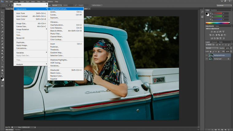
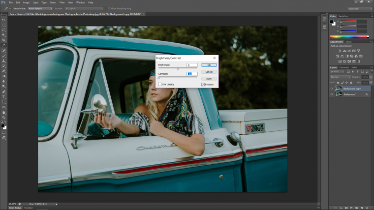
Then we are going to want to flatten our image a little, and to do this we have to go to the top of the screen and click on Image – Adjustments – Brightness/Contrast.
When you see the panel appear click on the slider below for the contrast and slide it all the way to the left-hand side, you will see your image drain a little bit.
Click OK and we’re ready to move to the next step. [Just before we move forward I just want to point out that if you wanted to do any Retouching at this stage this is when you would want to do it, so any Clone Stamping and things of that nature]
Next, go to layer again and create two more Duplicate Layers of the layer we just worked with.
Name the Top one Textured Layer and the one below that name it Low Layer.
Now click the Eye icon to the left of the layer name Textured Layer to turn off its visibility for now and then make sure you are clicked on to the Low Layer.
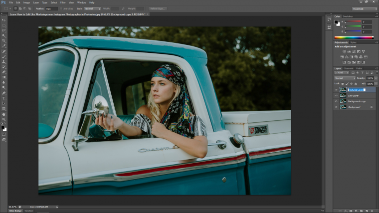
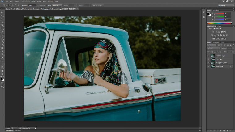
OK now we’re going to start to play around with the the Noise…so in case you don’t know what that is, if you look carefully at your images you will see that it is most probably made up of a lot of little pixels, well the more there is of this the more noise is in your image, ideally you don’t want to have a whole lot of noise unless it was your plan to have the image look grainy.
So anyway, what we do here is go to Filter – Noise – Dust & Scratches
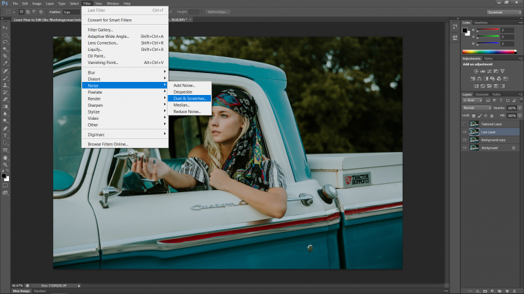
Ok so listen up for this part, I’m assuming that everyone else’s images out there are possibly/probably going to be a different size, grain, and composition from mine so the amount that we’re going to use here for the Radius Slider is going to be different so we are going to be looking more for how the image is going to appear, and the look that I will be going for is to make the image just on the knife edge of being blurred, so you want it to look blurred but you want to still see the details, for me it worked that 3 was perfect, you might be one less or you could be as high as 10 so just play with this range until you feel you have your image blurred enough.
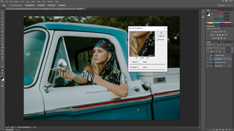
Next, you are going to click on that eye icon again so that it’s ready to rock after we save.
First, we’ll save up.
So go to File – Save As
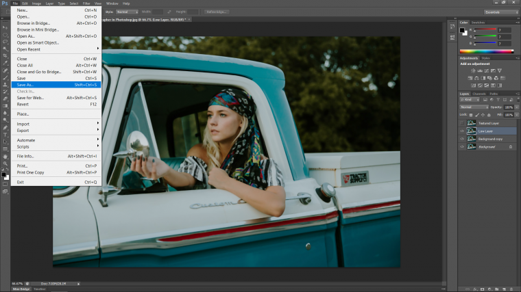
Then choose the location of your file, and for Format click on the drop down and look in the list until you see the PSD option.
This option will enable you to reopen your Photoshop file at any stage and continue from where you saved, so it’s the actual working document you have open right now.
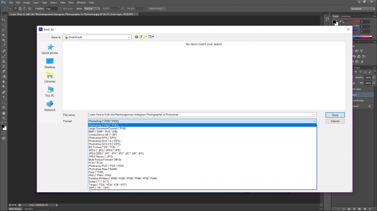
Click OK and you’re good.
Let’s move to the next step.
Right make sure that you have clicked on to the top layer, which is the Textured Layer.
Then make your way over to Image – Apply Image
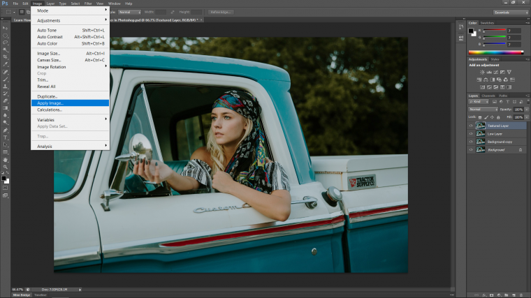
When you do this you will see a pop up appear and there are a few things that we are going to do in this panel.
So first look to where it says Layer Merged and click on that.
Choose the option that is the layer below the one you are working on, so click on Low Layer
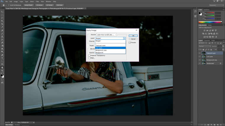
Then click on the little box that says Invert.
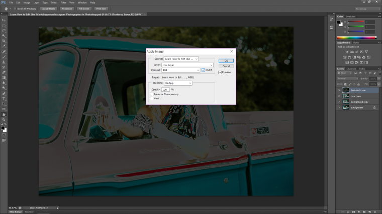
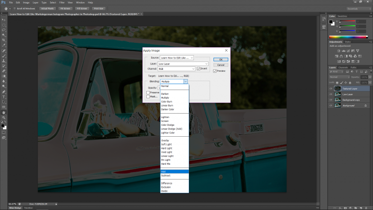
Next, we are going to the Blending Mode, click on it and click on the option ‘Add’
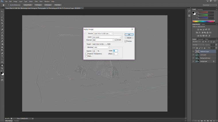
Last thing you are going to do if you haven’t already if change the scale to (2) and press OK.
Now take a look over to the original layers and in that panel you will see the word Normal in a drop-down box, click that drop down box to reveal all the different Blending Mode options available in Photoshop.
Now choose the option ‘Linear Light’
Now that layer will be see-through.
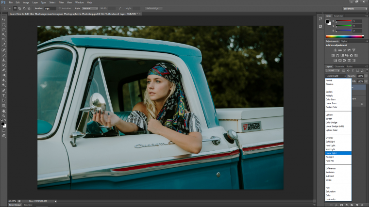
But we are going to pull this effect out a lot more. Also, you can learn how to create a Fish Eye effect in photoshop with us.
So click on your top layer and besides that you will see that there is an option for Opacity, drop this down so that it’s about 50%, I just want to get a half blur here, just a little bit again but have details remain.
You can change this about at any stage you feel like if you feel at the end or whatever you have blurred the image too much, just up the Opacity again and you’re good, 50% was good for me, yours maybe a little bit higher.

OK, now we are going to use what is called a Keyboard Shortcut to join all the layers together and create a ‘Stamp’ of the image.
So on your keyboard hold [Ctrl – Alt – Shift + E]
Then we are going to create a new duplicate layer of that layer.
When you have that new layer go to Image – Adjustments – Levels
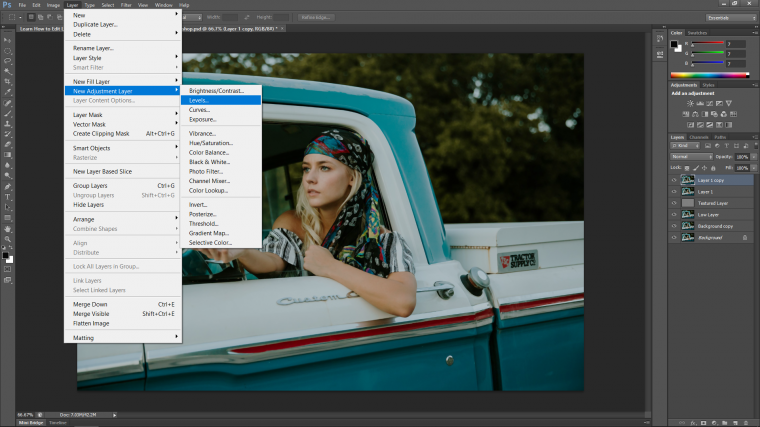
Move the middle slider toward the right-hand side to darken the image and press OK.
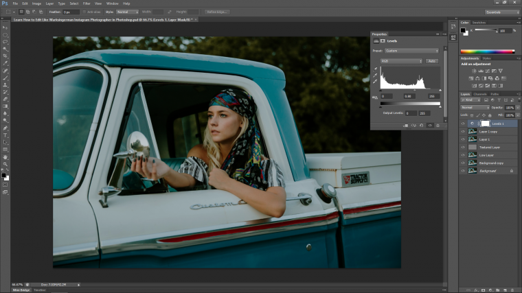
Create another Stamp [Shift – Ctrl – Alt + E]
Then grab your Elliptical Marquee Tool.
Change it’s Feather to about 30 first.
Then draw your selection from the top left down over your image. Don’t worry if it’s not placed perfectly you will be able to move it about with the arrows on your keyboard.
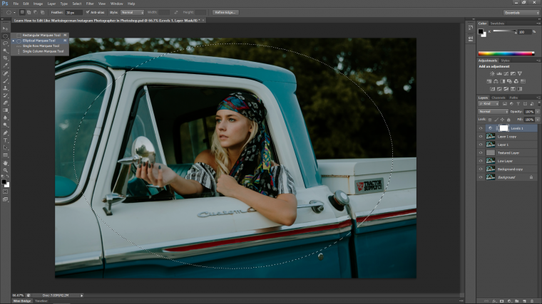
When you have done this, simply hit Delete on your keyboard to delete out the middle. Then click the Eye Icon to hide the Level Layer.
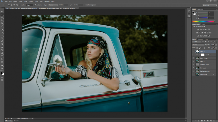
Then make a new Stamp of everything again.
Now we are going to start to bring back contrast.
So when we started the image we removed the contrast, the reason behind this is that when you start to color grade as we will be doing you generally want to have an image that has been flattened as it will be easier to see the color process rather than to start out with an image with strong colors and try to go from there, it’s like when a painter starts he generally stains his canvas with brown or gray paint to neutralist it down.
So to add back in the contrast go to Layer-New Adjustment Layer-Curves
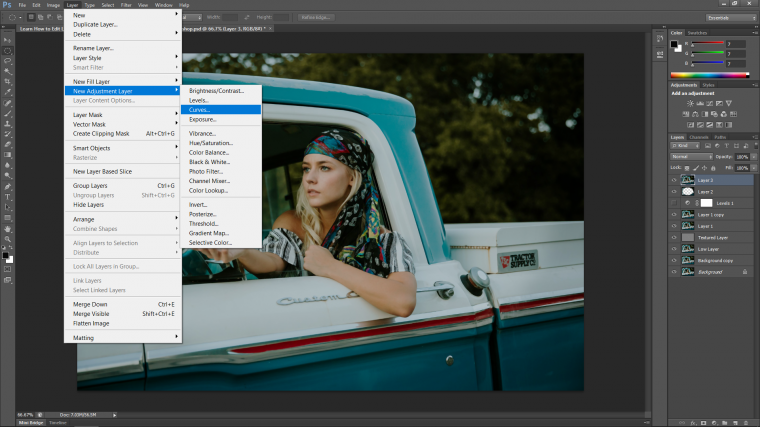
You will now see the pop up panel appear with the graph, where I have clicked on the centerline below do the same, so you click on the bottom one roughly at the top of that first square and pull it down a little, then just after the center square and pull it up a little, last the very top square but the bottom edge of it and pull it up a little too.
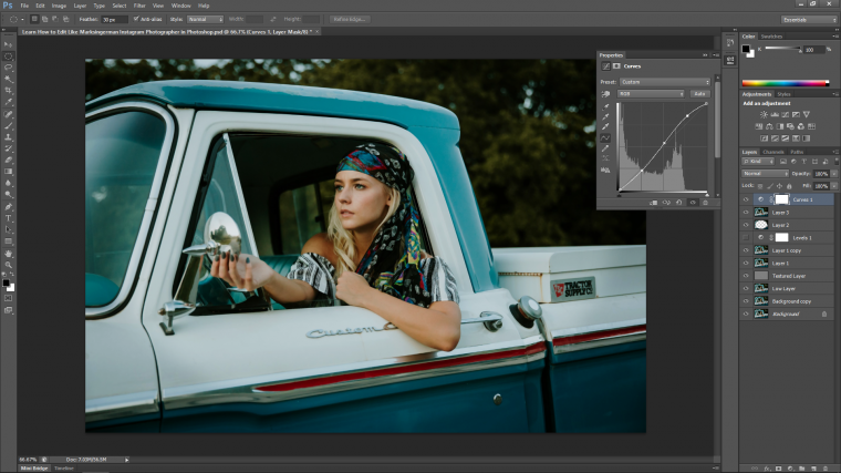
So just a quick note on those 3 points, the bottom one represents the dark’s, middle your mid-tones and the top is the highlights so keep that in mind if you can for the next time you use the Curves Tool.
You will also notice that some colors will now be introduced back into your image, but we’re going to push this a little further as our Photographer uses a lot of Teals which seems to be very much in style now with a whole lot of Instagram photographers.
Now it’s time to move into the color grading of our image.
Mark uses a lot of these Teal and Orange tones so we are going to try to push our image in that direction! so to do this let’s open up an Adjustment Layer.
Go to Layer – Adjustment Layer – Selective Color
OK, now you’re on your own! scary isn’t it! so now we have our little panel that has appeared.
You will see all the sliders and the color options.
At the bottom you will see two circles you can check off, one is Relative the other is Absolute, make sure Absolute has been clicked on.
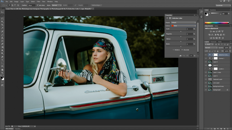
If you click on the color options drop down you will see lots of other colors.
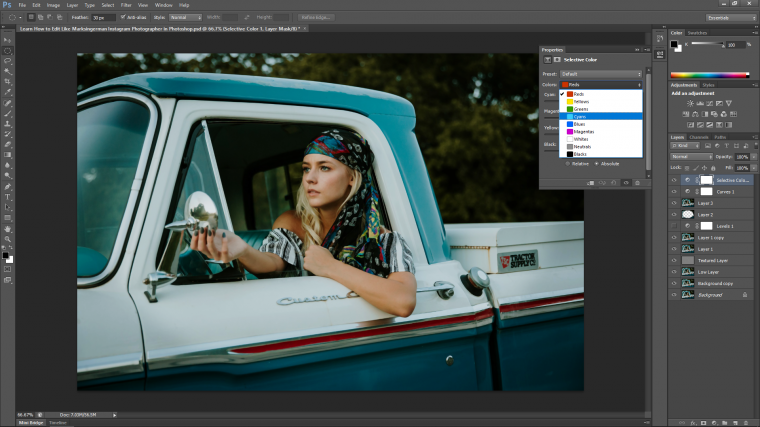
So now that you know that, what you are going to do now, and consider this a test, so this will take a good bit of trial and error, What I’m going to try to do here is to push all my Reds and Yellows such as skin tones towards an orange direction then do the same with the Blues but push them towards a Teal, with everything else you want to make them look brighter so long as you don’t start seeing unrealistic pixel groups forming.

Now we’re going to do a bit of Dodging and Burning, so what this is if you don’t know is basically Brightening your Highlights and Darkening your Shadows by using the Brush Tool.
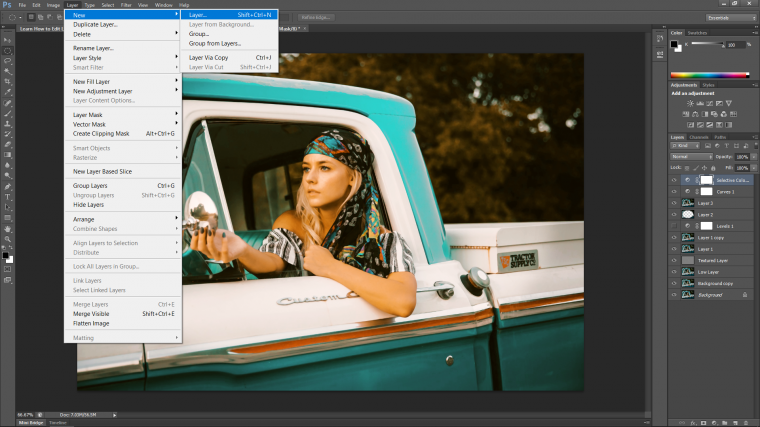
So the way we do this is first we must create a New Layer.
Layer-New – Layer
Then using the Paint Bucket Tool.

Choose Grey by double-clicking on the little Black Box at the bottom left.
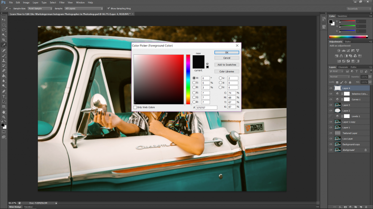
Then click as close to halfway as you can to get 50% Grey.

Using the Paint Bucket click on the screen of the new layer.
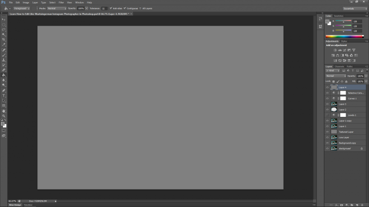
Then you must change the layer blend mode to Overlay so it becomes transparent.
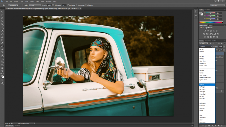
Now choosing the Dodge Tool you will be able to paint over the light areas to make them brighter.
But before you do that there is a couple of little setting you must do.
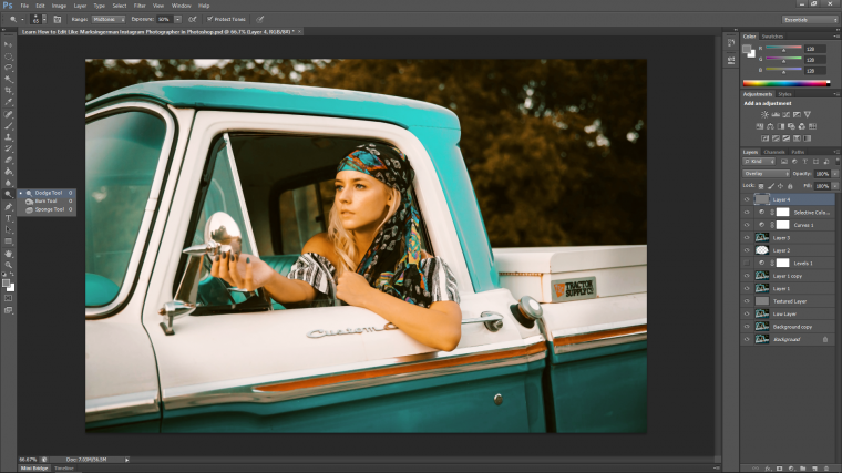
You have to change the Range to Midtones, and the Exposure to 50%.
Then start to paint along the Highlight areas, so areas like edges of the vehicle and the models feature such as cheeks etc
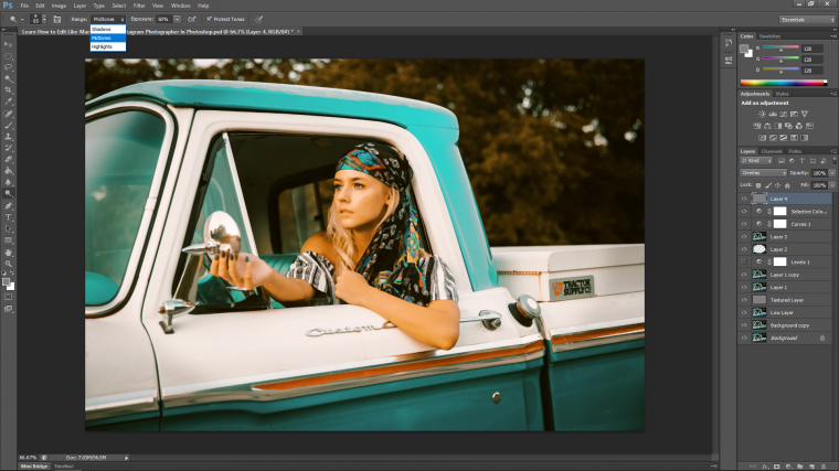
Then do the exact same with Burn, only you change the Range to Shadows!!
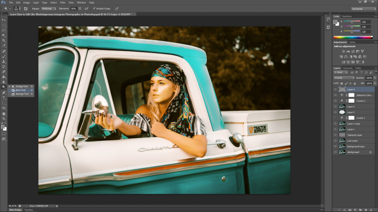
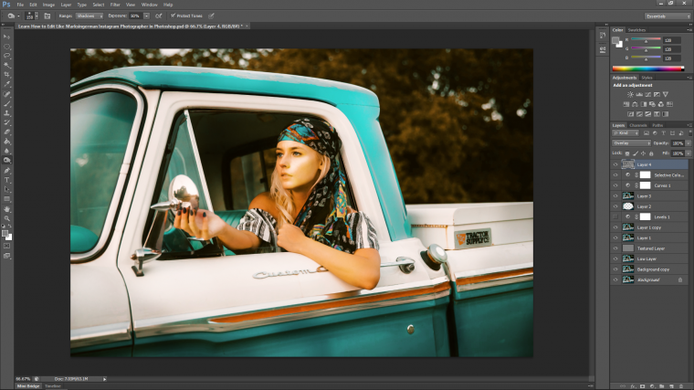
Once you’re done, if you feel your layer is too powerful you can always drop the opacity int he layers panel to about 50%.
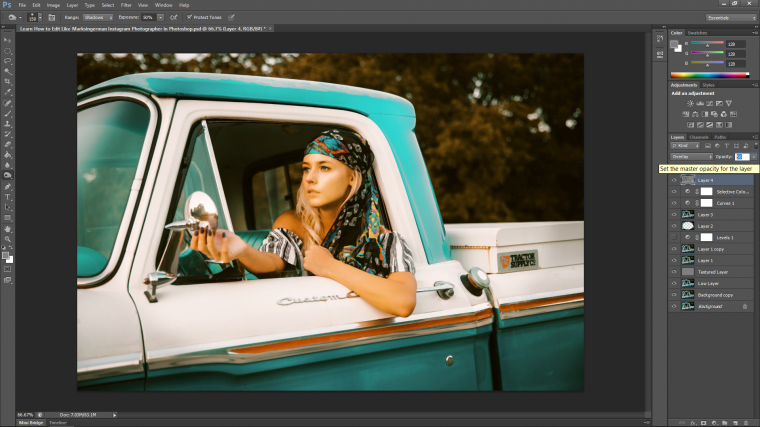
Now we’re going to create some lighting effects to finish up.
So, create a new layer as we did previously and just as we did with the paint bucket fill the screen of the new layer with all black this time.
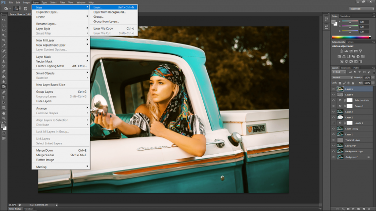
Then I’m going to make 2 Layer Duplicates so we have 3 in total.
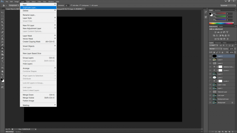
then take each layer at a time and go to Filter – Render – Lens Flare.
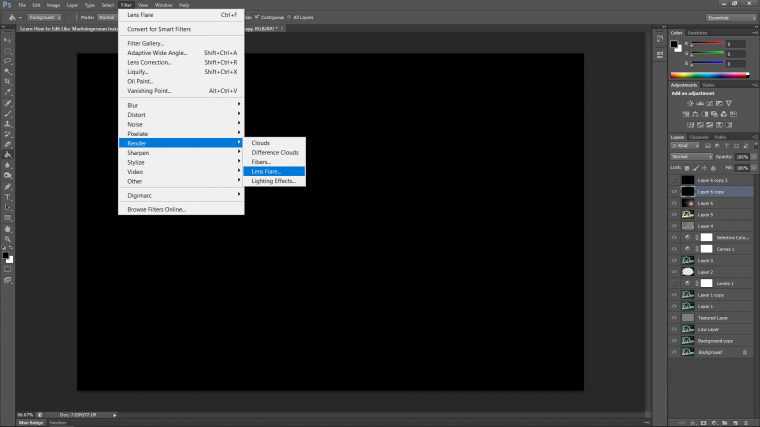
So you will have a few different options to choose from with the Len Flares, just choose a different one each time and use the slider to make it a little bit brighter, but not too crazy, the example I have below will work just fine.
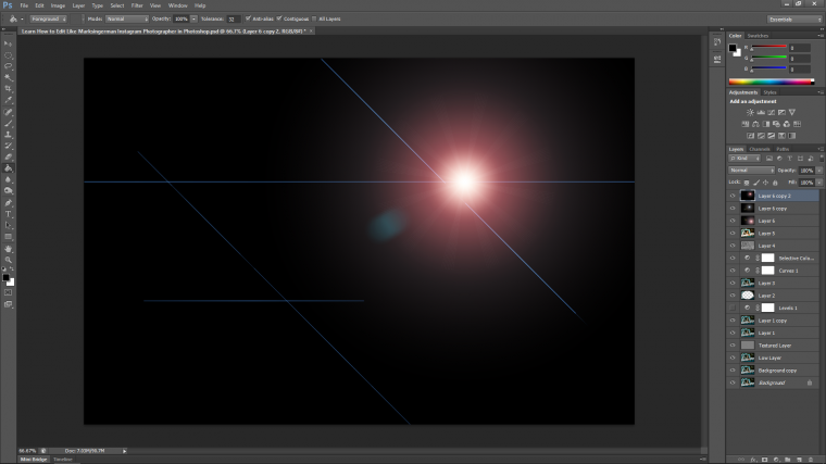
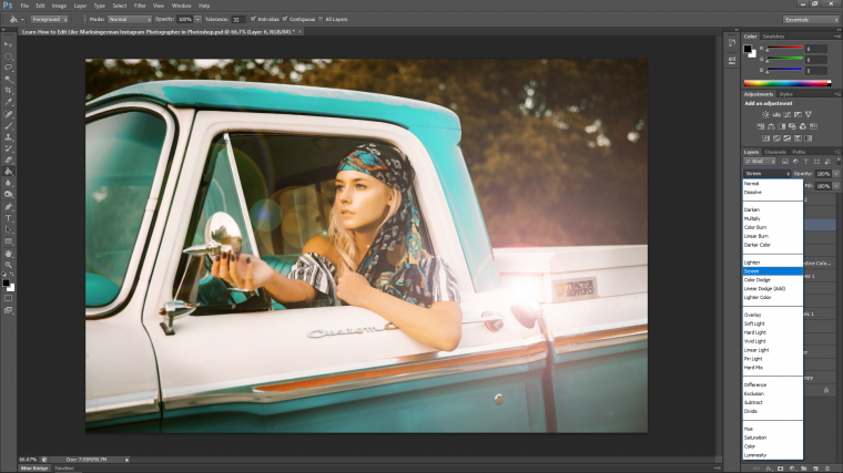
Then change each layers blend mode to Screen, so only the lighting effect is visible.
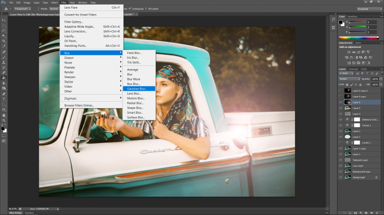
Next, I’ll add a slight blur to each as I go along using Gaussian Blur.
Filter – Blur – Gaussian Blur
Then you will want to reposition possibly, if not all good but if so key in Ctrl T, then you will be able to grab the image and shift it about and you will also be able to grab the edges and change the size etc. Note that if you hold shift it will constrain the layers size so it won’t distort and go all out of shape.
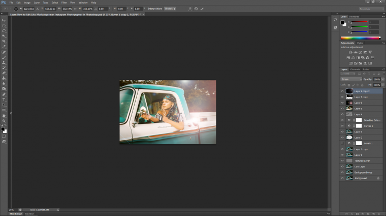
Be creative and play around with the layers and think about where the light in the actual image is coming from.
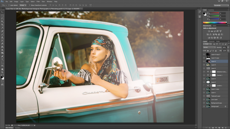
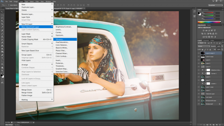
The last touch that I’m going to do is to add a Vibrance adjustment layer to the image.
Layer-New Adjustment Layer – Vibrance
I pulled my Vibrance slider up to +60 which worked well for my image, do yours to what you think is good for yours.
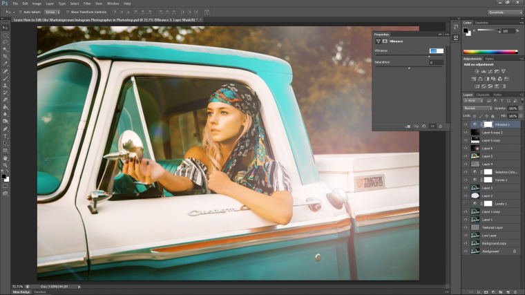
And that’s us! you should have a pretty cool image by now! I’m happy with how mine turned out, hope you’re happy with yours.
Check out Photoshop Textures collection here.
Comments (0)
There are no comments yet.