When I started to write this, I wanted to learn a little about why we have the 3:2 aspect ratio that is the sensor format for full-frame digital cameras and before that, 35mm film in the analog days of yore. Good luck getting a straight answer from history. My theory is there wasn’t a good reason and it was all just arbitrary.
Film lore has it that in the late 1880s, the inventor Thomas Edison and his assistants needed a film format for their movie cameras and Kodak happened to have film strips 70mm wide (don’t ask me why George Eastman—Kodak’s founder—chose that size). I suppose 70mm would have made the movie cameras a tad large, so they split the film in half and the 35mm result became Hollywood’s standard.
About 30 years later, Oskar Barnack of Leitz invented a “miniature” the camera which he loaded with rolls of movie film. Again, rather arbitrary if you ask me; the film format was there and he adopted it. And for many, many decades people were pretty much stuck with 35mm cameras whether they liked it or not. There are times when we consumers are mere sheep.
This completely over-abbreviated history lesson leads me to the topic of cropping. There are people out there who fervently believe proper photography technique involves “cropping in the camera,” or, “filling the frame.” That is, moving in, zooming in, moving out, zooming out until they absolutely nail the composition without a single wasted pixel in the final picture. They abhor the idea of cropping an image after they’ve shot it and as a matter of pride, won’t trim anything out of the frame. I will admit this makes sense to a degree. For the price of, say, getting a little closer, you won’t lose any resolution by having to crop deep into the image.
Yeah, but history suggests the format many of us use was arbitrary from the beginning, so to shackle our freedom of expression to someone else’s idea of size and proportion seems pretty ridiculous. Instead, I make my cropping decisions based on the subject I’m photographing. Many times, as I look into the viewfinder I visualize the final product and realize it will be better as perhaps a square or trimmed on the ends to 4:5 ratio. Or, hey, let’s throw out conventional formats altogether and go panoramic wide! Whatever makes sense for the image.

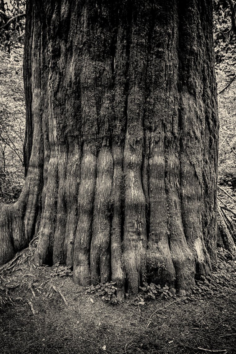
Granted, I occasionally forget my own advice and try to stick with what the camera gives me. Take this shot of a monster cedar in the Hoh River rain forest of Washington state’s Olympic National Park. After passing many specimens, some even larger than this lad, I chose a tree for its fluted bark surrounded by enough open space that I could set up my camera, a Canon EOS-1D X with a 16-35mm lens set at 32mm. The light, although a tad flat (it had been raining off and on), was pleasantly diffuse and was made for a black and white rendering.
So here’s the trap I stepped into: I felt as though I had to choose between landscape or portrait formats. Well, after all, it was a tree, I thought, so portrait made perfect sense. That would suggest the trunk went way beyond the top of the frame. That’s how I shot it.
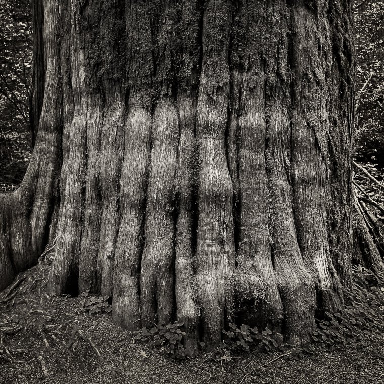
Unfortunately, as I worked on it in Lightroom and Photoshop, trying to bring out the bark’s texture and contours, I found my eyes uncomfortably flitting about the image unable to settle on the very thing I was trying to show. Yet, at first, I insisted that I keep the original framing without any cropping. Sometimes, you just get dogmatic without knowing why. Finally, I allowed myself the freedom to experiment by setting Lightroom’s cropping tool to a 1:1 ratio.

Boom! My eyes stopped wandering in search of a subject and the photograph was reborn.
With this example in mind, here are some of the things I consider when cropping:
Table of Contents
If there’s too much surrounding background because of the sensor format, crop it out and zero in on what you want to show. That background is often unnecessary and usually distracting. Yeah, I know, there are exceptions, but first understand your reasons for why you composed the shot the way you did and why you want to keep whatever it is you save from cropping destruction.

That’s pulling the viewer’s attention away from the subject? Sometimes you can easily deal with this by bringing down the bright areas with Lightroom’s Highlights slider in the Develop module. Then again, if that doesn’t work, trim out part or all of the offending brightness. I can’t tell you how many times I cropped out a bright sky just because it was annoying and completely improved the image.
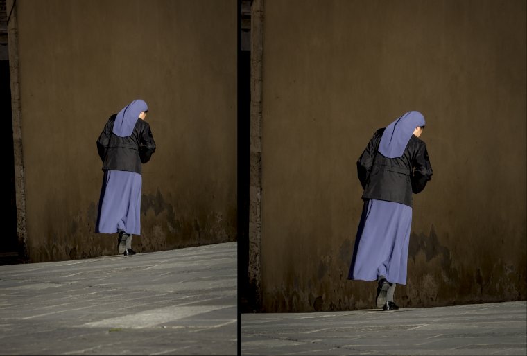
If something doesn’t seem right, play around with Lightroom’s crop tool. Nick a little off a corner and see what happens, or just try the different ratios supplied with the tool.
Maybe you allowed a wayward tree branch to stick through a corner and it can be easily chopped out. Or, there’s too much space above your portrait subject’s head. Perhaps, you blew the composition, but by simply readjusting the crop, it will look better. Whatever you do, don’t feel like a failure just because you didn’t get it right in the camera.

Oh, well, distortion happens. There are several ways to tweak an image to eliminate the issue. I usually start at Lightroom’s Transform tab and go for the automatic solutions. Is the horizon off? Hit Level and see what happens. A building looks like it’s tipping over? Try Auto, Vertical or Full. One of them might correct the image.
Overall, I’m not suggesting you be a slob about composition, thinking you can fix the picture later, but I am saying that just because some engineer or designer thought your camera’s aspect ratio was just right, doesn’t mean you have to obey them.
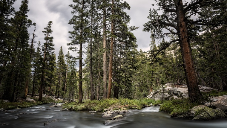
(The opening photograph was taken in Yosemite National Park on the Pacific Crest Trail. Shot with a 10-stop neutral density filter to get a 30-second exposure and thus smooth out the water, I cropped to about a 4:5 aspect ratio because the sides were dark shadows that added absolutely nothing to the picture.)
Comments (0)
There are no comments yet.