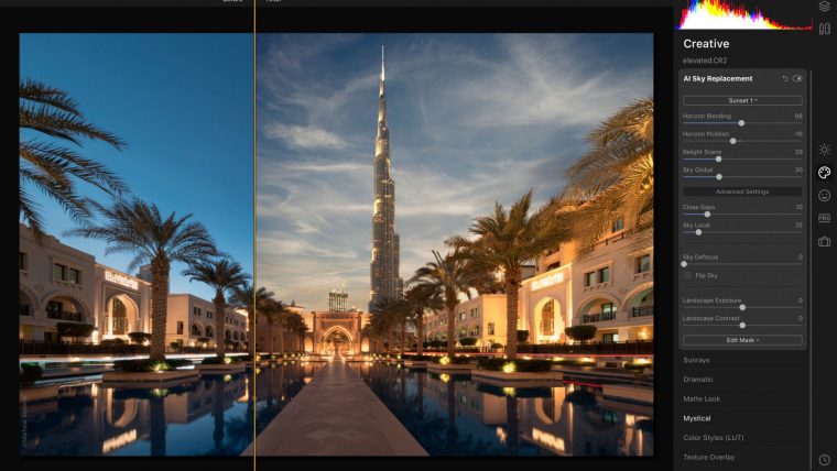
One controversial expected software is the release of the newest Skylum release, Luminar Neo. Many customers have been complaining about the fact of the not-so-smooth transition from Luminar 4 to Luminar AI, and now to Luminar Neo. With less than a month for the expected software release, let’s explore what’s known and what to expect.

Table of Contents
Skylum put efforts into fixing some of the performance flaws experienced in Luminar AI for this Luminar Neo. Something, as commonly seen as the software crashing when working with a photo, shouldn’t be expected up from the first bug release of Neo. Still, Skylum answered users’ comments by saying that Luminar Neo will not be as RAM-demanding as its predecessor.
The Early Access of Luminar Neo also showed differences between macOS and Windows versions. The Macs powered with M1 chips are, by default, the streamline for Skylum, whereas the Windows version is somewhat neglected.
It’s exciting to see that Skylum considered something as annoying as removing powerlines to be part of their software. It’s the first step towards more “professional-looking” landscape photos, and this tool looks promising enough.

Depending on the sky conditions, the Powerlines Removal tool works its way and blends the sky, covering the removed areas. Similarly to what you can expect in Photoshop, manual corrections are to be applied. If there are other elements like birds, street lighting or even storm conditions, the results will considerably differ.
In regards to the Dust Removal Tool, the behaviour is enhanced from Photoshop. The AI technology will detect the areas where our camera sensor got the interference of dust, and remove those particles without altering tricky details. This is a life saviour. You have no idea how many minutes you can lose if you are enough of a cleaning-freak to get all the particles off a photo; that lengthy process is reduced to a couple of clicks.
One of the most promising features Luminar Neo is introducing is their Relight AI Tool, intended to fix exposure issues. You can manage three sliders to control this tool: Brightness Near, Brightness Far, and Depth. That last slider can be a helper for portrait photography in low-light conditions. The advanced settings of this tool are intended for natural light, offering warming settings on the light conditions, and a Dehalo tool to correct solar halo issues.
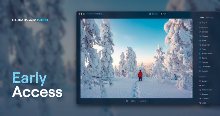
Skylum sticks to the familiar UI look we’ve been seeing in both Luminar 4 and AI. There are no major improvements; the tool sorting remains almost the same. The most noticeable difference is that we don’t see a section specifically made for the “templates”, Skylum’s newest name for presets. Since this was controversial during last version, we can expect a correction and stick to the old presets format instead of templates, that were amazingly confusing for users overall.

The mobile UI is agile, with enhanced performance for file sharing – again, following Adobe’s trend to market the app for easy social media sharing.
So far, this teaser version is intended to showcase the UI rebuild, and introduce new tools. Mostly geared towards convincing long-time customers to opt for the update. What’s surprising though is that the Early Access version lacks elements as crucial as the Histogram, or worse: there’s no way to undo a wrong click unless you undo your entire work with that tool (and same with re-do).
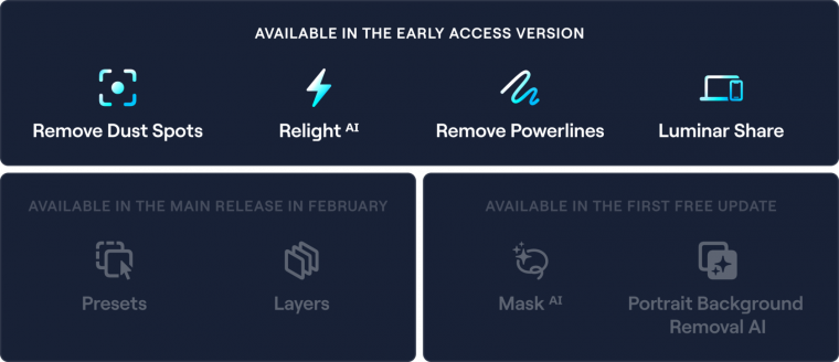
According to Skylum, Early Access is missing:
So why release this incomplete teaser when there’s only less than a month to release the full version? Don’t think already about uninstalling Luminar 4 or Luminar AI. Most likely this newest version of the Skylum software won’t see its prime performance until 2-3 bug fix updates.
Comments (0)
There are no comments yet.