What is contrast and how does it affect your photos? In photography, contrast refers to the difference in tones between black and white. This is also referred to as “tonal contrast”. There is also “color contrast”, which refers to the difference between the colors on the full color spectrum. The level of contrast in a photo can affect the mood, the amount of detail, the amount of color saturation, and can also be used to emphasize shape and form. We will take a look at the difference between low and high contrast photos, and how you can achieve those effects.
Table of Contents
High Color Contrast
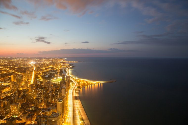
The photo above is a good example of high color contrast – the bright golden lights from the city and traffic contrast well with the dark blue water.
Opposite colors like yellow and blue actually complement each other. The colors accentuate each other, and they bring out the qualities of the other color. A good example of this is in the autumn, when the leaves are falling. The orange and red leaves complement the surrounding green grass to create a high color contrasting scene. This makes the colors really pop out, and is very aesthetically pleasing.
Low Color Contrast
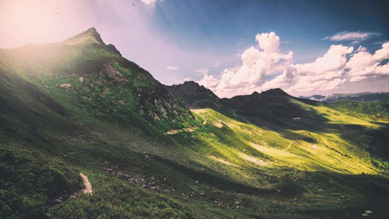
The greens and the browns in this photo are a perfect example of low color contrast. None of the colors pop out; the colors are very muted.
Low color contrast occurs when the colors in a photo are similar to each other. This creates a muted, quieter look and feel. Landscape photography will sometimes incorporate these types of photos. It can give the photo an almost vintage type of feel.
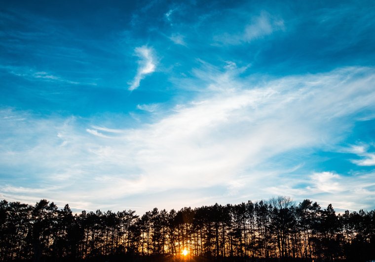
High-Key Scene
Because the photo has mainly bright colors (white and sky blue), it evokes a positive feeling.
Feeling positive? It’s not a coincidence! Photos with bright, vivid colors (high-key) bring out positive feelings in us. Many photographers take advantage of this by taking mainly high-key photos, and it eventually becomes their shooting style. Wedding photography commonly utilizes high-key photos to great effect. A great opportunity to take high-key photos is by taking photos with the bright sky in the background during the daytime. Another opportunity to take high-key photos would be by using bright or white backdrops. As far as camera settings go, a photographer can increase the brightness settings in order to increase the amount of light in the photo. This can contribute to creating a higher key photo.
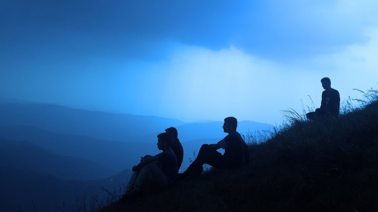
Low-Key Scene
The majority of dark colors in this image create a contemplative and serious feel to the photo.
In contrast, low-key images (containing mostly dark images and colors) create a gloomy, thoughtful atmosphere. Photographers sometimes use this effect to create silhouettes of people, as in the image above. Low-key scenes also have more of a focus on the shape and form of the subject(s). This can be useful in certain situations (if there are interesting shapes or patterns in the image), or if the photographer is looking to simplify the scene. Details are usually lost in low-key scenes; due to the low brightness, there are usually lots of dark shadows. Low-key photos are usually taken at night, or indoor where there is low-light. Brightness settings can also be decreased in-camera in order to create a low-key photo.
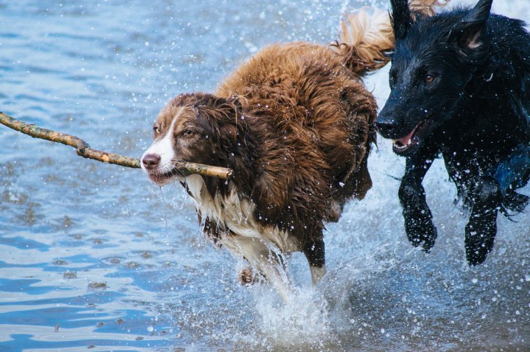
High Tonal Contrast
The black and brown dogs’ fur highly contrasts with the lighter-colored water, bringing out the colors in the photo.
As noted above, tonal contrast refers to the difference in tones between black and white. High tonal contrast makes the colors more vivid. This is usually preferred – hence, many post-production filters include increasing the contrast. High contrast scenes can be found during the daytime, when the sun is still out. Of course, contrast can also be easily increased in post-production.
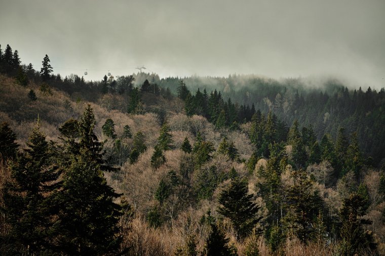
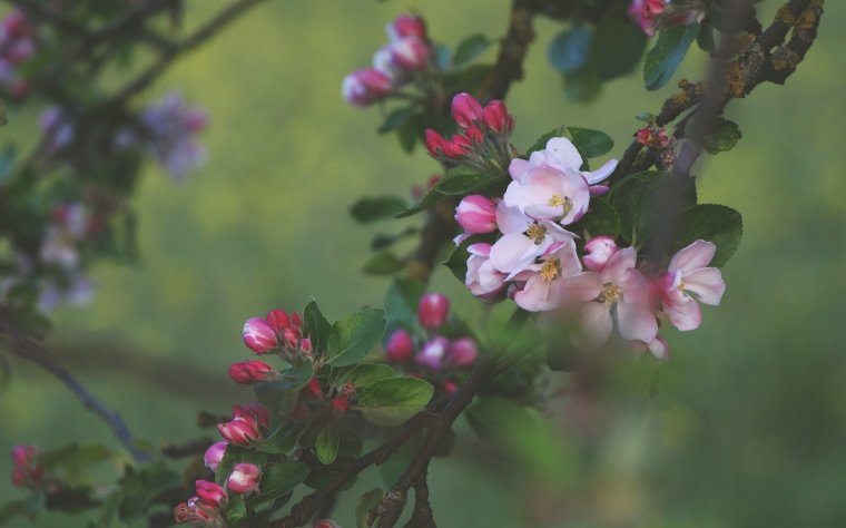
Low Tonal Contrast
The low amount of color contrast creates a muted feel to this photo.
Color saturation levels directly correlate with the color contrast. Hence, on cloudy days, you may have noticed that colors look bleak and muted. This is a direct result of the low tonal contrast created by the clouds blocking the sun’s light. This isn’t always a bad thing; in fact, the effect is even desired at times. Adobe Lightroom has many post-production filters that simulate vintage photos by decreasing the contrast.
Jonathan Ma is a freelance writer and professional photographer. He grew up in the beautiful Pacific Northwest of the United States. The natural beauty that surrounds this area has helped him to learn to appreciate art and photography. Jonathan's favorite styles of photography are nature and sports photography. He enjoys learning and teaching others what he knows.


 Facebook
 Google +
Comments (0)
There are no comments yet.