Have you ever captured some masterpieces but you did not know how to show them to the audiences in an interesting way? Montage could be your solution. The concept of montage was originated in filmmaking. It was later being borrowed into the world of photography.
Montage refers to an image that combines several images created using the same media into a single artwork.
– Angela Faris Belt
We usually see photographs as individual pieces of work. There are no observable relations between these photos. But we can actually connect them by putting them together into one montage after some careful selections. It is also commonly found on social media sites such as Instagram (via apps like Layout or similar) and Facebook. Undoubtedly, I am not teaching you to create some random montages that everybody is creating with those simple apps. I am going to cover the two approaches that you could consider for your future montages.
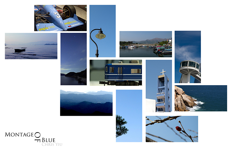
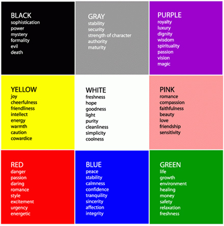
Before getting started, we have to choose a theme color of the montage. The montage below is what I made three years ago. It is not an outstanding montage but it would be good enough for demonstration purpose. I chose blue as my theme color at that time. Every color delivers unique feelings to the audiences. You have to consider what feelings you intend to convey to them. For instance, red color brings great visual impacts to the viewers and makes your montage looks energetic, while green color gives viewers a sense of relaxation. The theme color of the montage below, which is blue, evokes a feeling of calmness.
After selecting your own theme color, you have to choose an aspect ratio for cropping the photos selected. I suggest you crop it into some interesting aspect ratio such as 3:1 or 7:3 rather than the ordinary 3:2. The former simply looks more appealing, at least, to me.

My work three years ago.

The messages and feelings that colors convey. (Courtesy: Stackexchange.com)
A useful tool that you can consider when looking colors is Adobe Kuler, which serves to display combinations of colors that are harmonious together in real time.
Another site that can serve as inspiration is the blog of Art Therapy, which includes a very interesting article regarding color and psychology, in how they affect our well-being in the emotions that we can perceive from a color.
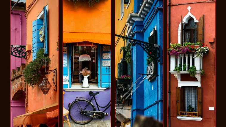
Repetitive subjects will appear in this type of montage. The subjects could be either tangible or abstract. We can have doors, windows, billboards for the tangible subjects. For the abstract one, you may consider polygons of architecture. We can have different colors included in the same piece of work while creating this kind of montage. Therefore, a montage of photos with similar subjects usually looks more vivid and vibrant in terms of color.
A montage of doors. (Courtesy: James Domine)
This type of compositions evokes Pop Art, in particular, the Andy Warhol’s painting with four versions of the portrait of Marilyn Monroe.
To enhance the effectiveness of the message that you want to convey these montages, it is necessary that images share certain parameters: size, composition of the same picture, and even the type of object (example: If you make a montage with several windows, include only windows; if you do doors, include only doors). The neater they look, the better your montage is going to look like.
I have had a great fun while making a montage. Although you could make a montage of the photos on your hands, I strongly recommend you to shoot for a montage. It is a great chance to train your observation and photographic instincts as you will look for subjects of the same theme throughout the photo shoot session. Well-trained observation is an important character that a good photographer should possess. Besides, who doesn’t feel tempted from time to time to add a beautiful composite art piece in your living room? It can give a boost to the style of any apartment, studio or home, regardless of its style.
Hope you guys find this guide inspiring and see you next time!
Comments (0)
There are no comments yet.