How to work with Forgotten Postcards: Sepia Toneswww.sleeklens.com
We’re back with another tutorial (accompanied by a great video), this time focusing on how to use our “Forgotten Postcards Workflow” to apply sepia tones to your photographs. Years ago when photographs were developed through a chemical process, the sepia effect was a way to add warm brown tones to photographs. With today’s technology we can apply the same effect through Lightroom, which we will get into now.
In the past, the sepia effect was reserved for making black and white photographs, however with digital photography, it is an effect that can now be used with color photos as well.
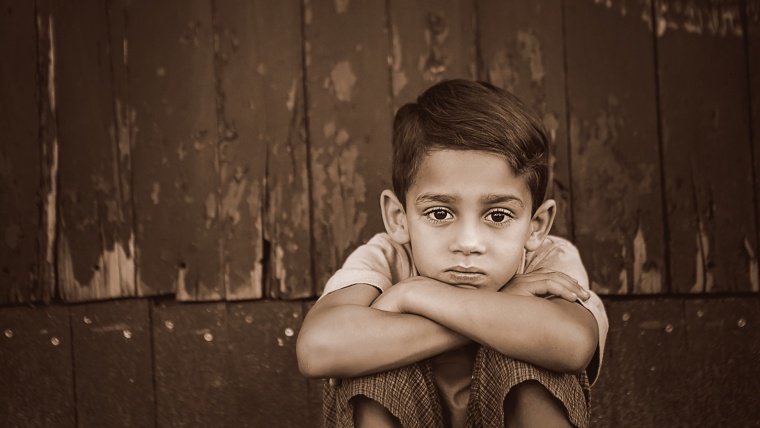
With our photograph pulled up, we will go ahead and get started. The first thing that we are going to do with this is to apply a “Forgotten Postcards” preset. You may notice that many of the presets included with this workflow have that rich brown tone to them. Starting with the Vintage Matte presets, we are going to apply Vintage – Matte Autumn. Once applied, you will notice that it has added our desired brown sepia tone to the picture.
Since we toned this photo, the effect has also added that brown tone to the highlights and whites. For that reason, we are going to make one more edit to this photograph by going into our “Forgotten Postcards” brushes and selecting the Light – Brighten brush. We are going to use this brush to brighten up our subject’s eyes a little, to correct for our previous edit that applied a darker tone to the entire photo.
That was it for our first photograph, just a quick two edits. Though these were fast and simple, the effects really changed the outcome of this image and even added a vignette, which was part of the Vintage – Matte Autumn preset that we applied. The end result is a warmer vintage feel while keeping some of the brightness in the eyes.
Now we will move on to our second photograph to edit. For this one we will start out by applying one of the “Forgotten Postcards” Nostalgic Effects presets. We will use Nostalgic Effects – Vintage 16, which will get us started with a sepia effect. I want to tweak this preset a bit, so we will go into the Basic Panel and raise the Exposure and Contrast just a bit, then turn the Shadows down some.
You may notice that sometimes when you apply a sepia tone to a photograph, it may basically convert the photo into a black & white, in a sense, with a brown tone. To work with that a bit, we will open up the B&W tab in the panel. This will give us access to the color sliders, which we can adjust to alter the color tone of the photo. For example, if I move the yellow slider up and down, it will change how much of that color appears in my picture. You will be able to see those adjustments change in the histogram as you make them. For our photograph, we are going to turn up the yellow to add some more light.
Note: If a color does not have much of a presence in the photograph, the adjustments with that specific color will be minimal, if at all.
Next, we are going to give this photo more of a vintage look by applying the Medium Black Vignette to it. Once applied, it seems a little too strong, so we can adjust that by going over to the panel and opening the Effects tab. Once there, under Highlight Priority, turn the Amount up just a bit to soften the vignette a little.
In our finished edit, we see a photograph that started as a nice color photo, and now has been transformed into black & white with a more vintage look and a light sepia tone.
And now on to our third photograph to be edited. We are going to start this one with a Nostalgic preset, similar to the previous photograph, however for this one we are going to use Nostalgic Effect – Vintage 10. This gives us our sepia effect. On top of that, we will apply another “Forgotten Postcards” preset, this time we will use Exposure – Brighten. Although this preset has added more light, which is what we wanted, it has also blown out some of the highlights in the photo. We can fix that by opening our Basic panel and turning the Highlights down some.
Now in our photograph, we have some split toning going on. To work with that, we are going to go over to the panel and open up the Split Toning tab so we can tweak the presets and get the colors that we are looking for. In the split toning tab we can adjust the highlights and the shadows. In the highlights we can see the Now we will move on to our second photograph to edit. For this one we will start out by applying one of the “Forgotten Postcards” Nostalgic Effects presets. We will use Nostalgic Effects – Vintage 16, which will get us started with a sepia effect. I want to tweak this preset a bit, so we will go into the Basic Panel and raise the Exposure and Contrast just a bit, then turn the Shadows down some.
You may notice that sometimes when you apply a sepia tone to a photograph, it may basically convert the photo into a black & white, in a sense, with a brown tone. To work with that a bit, we will open up the B&W tab in the panel. This will give us access to the color sliders, which we can adjust to alter the color tone of the photo. For example, if I move the yellow slider up and down, it will change how much of that color appears in my picture. You will be able to see those adjustments change in the histogram as you make them. For our photograph, we are going to turn up the yellow to add some more light.
Note: If a color does not have much of a presence in the photograph, the adjustments with that specific color will be minimal, if at all.
Next, we are going to give this photo more of a vintage look by applying the Medium Black Vignette to it. Once applied, it seems a little too strong, so we can adjust that by going over to the panel and opening the Effects tab. Once there, under Highlight Priority, turn the Amount up just a bit to soften the vignette a little.
In our finished edit, we see a photograph that started as a nice color photo, and now has been transformed into black & white with a more vintage look and a light sepia tone.
And now on to our third photograph to be edited. We are going to start this one with a Nostalgic presebrown color, so we will change that a little bit by turning down the Saturation in the highlights just a little, not too much. Then we’ll slightly turn up the Saturation under Shadows.
Similar to what we did with our last photo, we are going to be adjusting some color sliders in the B&W tab. For this picture, we’ll turn down the Purple and Magenta sliders. This will add a little darkness to the photograph.
Now that we are finished with this photo, we have given it that sepia effect, although with this one it is more of a yellowish tone. We also darkened the subject’s clothing, which was pink in the original color photograph.
I hope this was both entertaining as well as informative. Please join us again for the next one!
Pia Lopez is a self-taught photographer, graphic designer and ArchViz artist. As Content Director of Sleeklens.com, her work is driven by her two biggest passions: technology and art.


 Facebook
 Google +
Comments (0)
There are no comments yet.