How to Work with Color Fantasy: Using Color for Seasons in Lightroomwww.sleeklens.com
Hello, today we are going to be working with the “Color Fantasy Workflow” by Sleeklens. We’ll be talking about how to use this workflow to really enhance the photographs that you may take during different seasons.
So getting right into it, I have my first photograph open, which looks like it was most likely taken sometime during the spring. There are two girls in the photo wearing colorful spring dresses and the grass is nice and green. And let’s see how Color Fantasy could help improve the photo.
We will start out by applying an All in One preset and for this one, we will go with Colorful Dreams. For the spring we tend to use a lot of pastels and bright colors, so for this photograph I’m really going for a bright and saturated effect.
Next we will apply another preset, this time we will scroll down and select Exposure – Darken Shadows, to help add a bit more contrast.
Then scrolling down to the Color presets, we are going to apply the Color – Green Burst preset. Like its name suggests, this preset changed what was yellow toned grass to a more of a green color, which is a nice fresh color for spring.
Let’s now go down to the Tone presets and applythe Cool Shadows preset, just to add a slightly cooler tone to the picture and get rid of a little bit more of the yellow.
The last thing that I am going to do with this photograph adds a vignette. Let’s scroll down through the presets and select Vignette – Subtle Black. Even though I added this vignette, I feel that for this photo, it needs to be tweaked a little. So for that, we’ll go over to the Effects tab and change some settings under Highlight Priority. Currently set at -13, we’ll move the Amount Slider up a bit to -6.
Now we are going to open up our “Color Fantasy” brushes and select Light – Brighten. With this brush, we will turn the Exposure up just a little, then apply it over the two girls in our photo, just to add a little bit more light to them.
Closing out the brushes, we’ll move down to the Basic tab and turn the Highlights down some, because when the preset was applied the Highlights were turned all the way up, slightly blowing out the suns reflection directly on the subjects.
Now going back into the “Color Fantasy” brushes, we’re going to use the Light – Add Golden Sun brush. Then, before applying this brush, I’m going to change the color of it from a very golden yellow to a lighter tone of yellow. Once that’s done, we can go ahead and apply the brush to the parts of the photo that are directly lit by the suns rays, such as the visible beams coming through the trees in the background and onto the subjects.
So that’s all we are going to do with this photograph. Starting with a photograph that was really washed out and lacking in color, we’ve added a lot of great color and light back into the photo. Bringing out those nice colorful spring tones, we have really enhanced this photograph.
Moving on to our next photograph. This photo of three girls sitting in a beached row boat looks like it may have been taken in the summer. One thing that I want to touch on is that even though the “Color Fantasy” workflow is about color and light, they don’t always have to be bright, vibrant colors. It really is left up to what colors and light work best with the scene and the environment in a particular photograph.
With this photograph, even though it was taken during the summer, it looks like the picture was taken around dusk and has a much more muted appearance, so we’re going to go with that theme for this one.
So, the first thing that we’ll do is apply an All in One preset. When we scroll through the “Color Fantasy” All in One presets, we are going to go to the Good Old Days preset, which will add a lot of life to the photo and really brightens it up.
Since that all in one preset took away most of the blue that was in the photo, I am now going to apply the Color – Blue Burst preset to give us some of that blue tone back.
One of the defining features of this photograph is the pretty light blue dresses that the girls are wearing, so to bring those out a little more, we’ll go into our “Color Fantasy” brushes and select the one named Haze – Cyan. To make this brush a little less hazy, I’ll turn the clarity up just a bit, then we can apply the brush to the dresses to bring out some more of that blue color. Remember, you can adjust the size of your brush to suit the area that you are working with. We’ll also turn up the Saturation, Exposure and Contrast add more light, while applying this brush.
Then click New, and apply the Haze – Cyan brush once again, just to add a bit more light.
The nice thing about the Haze brush is that it really adds to the tulle dresses, since the tulle fabric already has a hazy look to it.
Before moving on, I am going to use that Haze – Cyan one more time, but in the sky and on the horizon, just to bring some of the other blue tones back into the photograph.
So moving on, we’ll go ahead and click New to start a fresh brush. For our next brush, we will use the “Color Fantasy” Color – Green Tint brush and add some green back into the tall grass behind the boat.
One of the nice things about this workflow is that it comes with some really great color brushes, which basically work like a real brush, allowing you to paint as you would on a canvas.
Click New to start a fresh brush and this time we are going to use the Light – Brighten Shadows brush. We’ll run this brush a little over the side of the boat and also on the ground, brightening shadows and pulling a bit more detail out.
For the last edit to this photo, we’ll go into the Details tab and turn the Amount up under Sharpening.
In the after effect of this photo, we have added a lot more light to the photo while keeping the nice blue colors that were there. We’ve also added a warm vintage feel to it, which gives that relaxed summer vibe to the photograph.
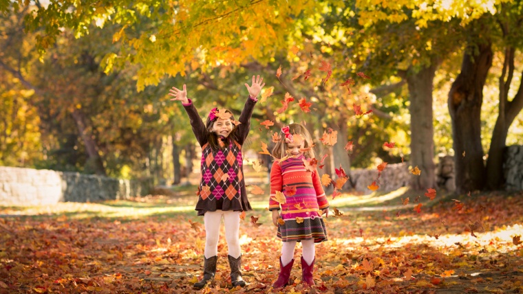
Next up, we have a photograph that looks like it was most likely taken during the fall. In the fall we typically see really awesome rich reds and oranges and other nice autumn colors.
We are going to be starting this one by applying an All in One preset, which will be Retro Vibe 2. Once applied it kind of washed out the color, but it did give the photo a nice matte look.
So, to get some of that color back we will add the Color – Magenta Burst preset, which will bring a lot of the tones out that are in the subject’s dresses and the ground which is covered by leaves.
For this photograph, I do want to apply a vignette, so we’ll go with Medium Black. With that applied, I do want to turn down the vignette just a little bit, so we’ll go into the Effects and move up the Amount under Highlight Priority just a bit.
Like we did before with the other photographs, We are going to start using the brush to add color and light back into the photo.
For the first “Color Fantasy” brush we are going to use Light – Brighten. Once selected, we’re going to turn the Exposure up a tiny bit and apply this brush to the girls in the picture, giving them just a bit more light. Since they are the subjects of the photograph, we want them to stand out a little more.
Then, we’ll click New, and go back into the “Color Fantasy” brushes. Now, we are going to use some of the Color brushes to add some of the color back to the photo. The first one that we are going to use will be the Color – Magenta brush. For this brush I left the Feather at 100, but I did turn the Flow down because I don’t want to have so much color that it looks unrealistic. We’ll apply this brush in spots in the leaves on the ground and in the trees, to get some of that red tone back.
Next we will use another Color brush, this time Color – Mustard and apply it just as we did with the magenta brush.
Now, one last “Color Fantasy” brush. We’ll scroll down and select the Haze – Golden brush, which we are going to use up in the trees.
So, that’s it for this photograph. Although we didn’t make huge changes to this photo, the effects are subtle with added light and a nice matte finish. We also brought us some of the warmth with those fall colors.
I hope this tutorial was helpful and you get to try the “Color Fantasy Workflow” out for yourself soon.
Pia Lopez is a self-taught photographer, graphic designer and ArchViz artist. As Content Director of Sleeklens.com, her work is driven by her two biggest passions: technology and art.


 Facebook
 Google +
Comments (0)
There are no comments yet.