How to Work with A Winter’s Tale – Adding Color and Tone to Winter Photographswww.sleeklens.com
We return with another tutorial about working with our “A Winter’s Tale Workflow”. This time we will get into how to use the presets that are included with this workflow to add color and tone to your winter photographs. A really great thing about winter photographs is that when you are taking them in the snow, it gives you a big white canvas which will make your colors in the image really pop. Depending on what you envision as your final result, you may want to either make the colors stand out or mute them a bit. Often times in the winter, even if it isn’t snowing, the scenes will normally be lacking in foliage giving a muted tone to the environment. We will touch on most of this while we work with this workflow, so let’s get right into it.
We will begin with our first photograph by starting out with the All in One – Warm & Cool preset. Now that we have applied this preset, We are going to tweak it a bit. Although all of the preset are “one click edits”, they can be completely adjusted to fit the needs of your specific job. So, let’s go into the Color tab and make the subject’s red sweater stand out more by turning up the Red under Saturation. We will also do the same with the Green and Aqua to make those colors stand out a little more as well.
A lot of times you may find that when you have a winter photograph with snow in the scene, you may need to turn the highlights down to keep them from being blown out, even if it seems that your subject is properly exposed.
That is it for the first photo. We didn’t really do to much, however the changes are noticeable. Although we did make some adjustments, we have only applied one preset and tweaked the color and highlights.
Let’s move on to our next photograph. One advantage to editing photographs where there is a wide open, snowy environment is that it allows you to really use tone however you want. For this photo we are going to add a purple tone, so for that we’ll use the All in One – Lilac preset. Once applied, it has made the photograph very purple. Since it is a little more purple than I want it to be, we will go over and open up the Basic tab and make a few adjustments. We’ll start by turning the Temperature up some so the lilac color isn’t as cool. Then, we will also turn the Tint down just a little. And also, we will turn up the Contrast a bit.
Finally, we will go back over to our presets and scroll down to the “A Winter’s Tale” vignette presets, selecting Vignette – Black. And that’s it for our second photograph. Another quick edit that significantly changed the image. We have applied a purplish tone and a vignette which really changed the overall feel of the image. This edit wasn’t really meant as an enhancement, but rather just meant to alter the feel by changing the color tone a bit.
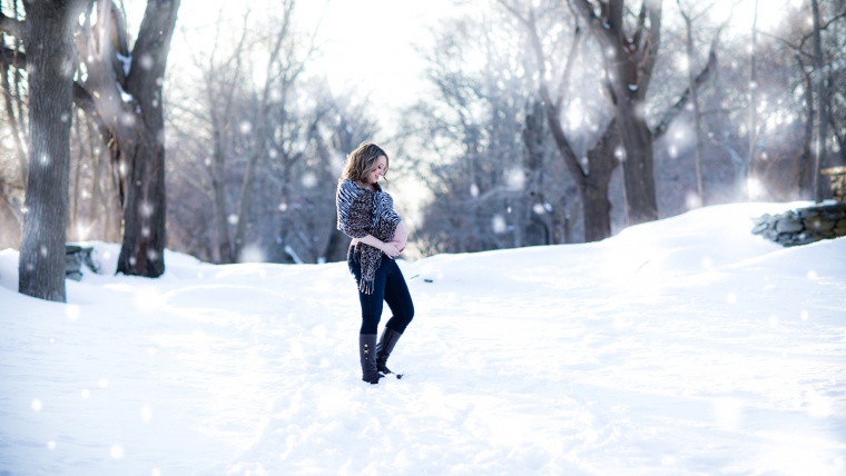
Now we will move along to the third photograph that we are going to edit. One great thing about Lightroom is that, when you have your navigator open, you can scroll over the presets in your list and it will show a preview of what each preset will look like while the cursor is over it. That definitely takes a lot of the guessing out of it.
Let’s go ahead and start this photo out with the All in One – Maple Syrup preset, which will add a yellow tone and increase the contrast some. For this photo, I feel that the Contrast is a little too high so we will turn it back down a little. We’re going to turn the Highlights and Shadows down just a little bit as well. To tweak this preset some more, let’s open up our Color tab and turn down the Blue and the Yellowjust a bit, and then turn the Orange up some.
Another way that we can adjust the color tones is by going into the Split Toning tab and use the Highlights or Shadows to apply tones, but we will save that for another day.
Let’s go back over to our All in One presets and this time we’ll go with Winter Night, which also adds a vignette. The vignette that was applied is a little too dark for this particular photo, but we can adjust that by going over to the Effects tab, then under Highlight Priority we will turn the Amount up to lighten the vignette.
Before we finish we are going to apply one more preset as a finishing touch, this time we will use the Tone – Creamy Highlight preset.
Now that we have finished with this photograph, we have applied a few more edits than with the previous photos. The end result is a scene with a much warmer tone and feel to it. Although we applied more changes to this one, it was still a quick and easy edit.
Thanks for following along and don’t forget to check out our YouTube channel for more great video tutorials.
Pia Lopez is a self-taught photographer, graphic designer and ArchViz artist. As Content Director of Sleeklens.com, her work is driven by her two biggest passions: technology and art.


 Facebook
 Google +
Comments (0)
There are no comments yet.