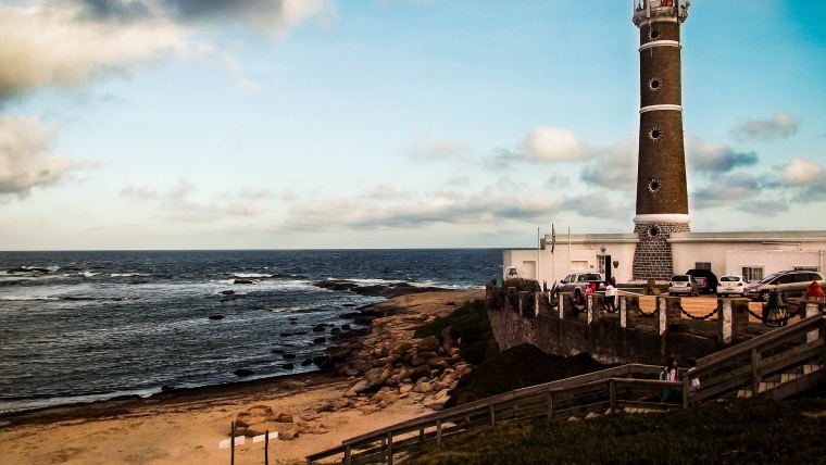
One of the themes that most caught my attention, when I started to work in landscape photography, was portraying scenes with lighthouses. Perhaps because of the simple fact that here in Uruguay they are a common sight: the typical beach scene with rocky areas or small mounds of sand and turf, joined some seagulls adorning the landscape of a deep blue sky and waves breaking on the shore. But regardless of the fact where I’m currently based at, photography of lighthouses is one of the classics of the maritime landscape photography; not only for what these pictures are capable of expressing, thanks to its ambiance, but because of the challenging game with constant contrasts of light and shadow, causing underexposure to be one of the most common problems encountered.
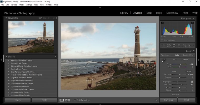
For that, I would like to teach you guys how to perform a complete editing process of a marine landscape photograph including a lighthouse using Adobe Lightroom, since, I think, this is the fastest and most efficient tool for photographers ‘on the go’.
Let’s start by importing our images from the memory card to Adobe Lightroom
After completing the culling process with the imported images, select the image with which we will work. In my case, as you can see, this photograph in addition to the initial exposure problems also features some problems in regards to its composition and the position of the horizon line; so my idea is to start correcting the composition details of the image before even thinking about bringing to life the rich tonal range of this photo.
Switch to Lightroom’s Develop Module and let’s get to work!
My first approach is going to cut this image a little bit on the sides so that the Lighthouse is in an area close to a third of the total area of the image, therefore I’ll be using the Crop Tool to proceed with the trimming process.
My next step is to adjust the framing details of this image and the position of the horizon line. To make these adjustments, it is necessary to display the menu Lens Correction, and access to the manual setting options. The ‘Rotation’ setting is the one I’m going to use in order to correct the position of the horizon line in this image, until it is aligned.
If I were truly critical with this photo, I would say that it is a pity that the horizon line is so high, almost reaching half of the picture’s height value, but since it was taken as a picture to be used for practice, I’ll keep editing it in order to explore what Lightroom can do for my images.
Using the Crop Tool again, I’ll slightly adjust the size of the picture so that the white portion of the sky, that showed up after rotating the picture, won’t be noticeable and same to lower the height of the horizon line. With this, we can now move to the next stage of our editing process, which is working with sliders and brushes.
First and foremost, and as a way to compare what can be achieved by working manually with Sliders or Presets such as the Landscape Essentials Workflow bundle, I will create a virtual copy of my image by right-clicking over it and selecting the option “Create Virtual Copy”, so I do not lose settings for the size and position of the horizon that I have made.
I will begin by giving a warmer look this photograph, increasing the value of Temp to + 14. Tint values will remain untouched.
As this photograph has Exposure problems, I will not correct all of these with the Exposure slider in order to achieve a natural look. Increase the value of Exposure to + 0.36 and move on to edit each of the Sliders that control the global illumination of this photograph independently.
Contrast values will remain neutral by now, as my focus is going to be targeted on correcting the other sliders first – Next, lower the value of the Highlights.
Add lighting to your photographs by moving the Shadows slider toward the positive values – with this, the underexposure will be virtually non-existent.

I’m going to add a small amount of Whites as a further reduction of this photograph’s underexposure.
And finally to bring Blacks to negative values to strengthen existing dyes.
By accomplishing these adjustments we can increase the value of the Contrast slider to the picture and go to advanced settings.
Let make a brief Before/After to compare how did our photograph looked like at the beginning.
The result is pretty convincing; now we must work to enhance the appearance of the sky, increase details, and working some tones.
I move on to select the Adjustment Brush tool for enhancing both Water and Sky. You may say that I can also use the Graduated Filter tool for the sky, however I prefer to work this way as the Lighthouse takes a good portion of the sky, and my intention isn’t to affect its hues.
I will work with these two brushes: Out of the Shadows, HDR – Dark Sky and Brick and Mortar Workflow – Water Definition (which is also included in the bundle Through the Woods Workflow), in modified versions that fit my needs. The idea is to cover both the area of the sky and water with every brush corresponds as a way of highlighting different areas.
Then, I will select another new Adjustment Brush layer and with the settings shown here, I’ll paint across that region, which does not belong neither to the sea or in the sky.
To finish the work, add a little vignetting effect and voila!
The Before/After will speak by itself alone.
Impressive, right? Remember the photo that we keep having the Virtual Copy? Good, we will appreciate now a version of that image that has only been edited with Presets and Brushes from Sleeklens. I’ll use the preset: “All-in-One Warm Shadows” of the bundle Through the Woods workflow.
The image looks a bit less like an HDR-look alike, which is a good thing, and you don’t even need to use brushes as they are meant for adjustment retouching. Also you can edit a bit more the exposure values, but for a pic edited in 2 seconds, the result is more than desirable.
As you can see, there are different ways to edit a maritime picture like this. You just only need to know technique and creativity to achieve everything you ever dreamed of capturing.
I hope this guide has been useful and see you next time!
NB: If you want to complement the quality of this work I recommend you take a look around the bundles of Photoshop Overlays, with different realistic options for unique natural lighting effects.
Comments (0)
There are no comments yet.