Overview on How I Develop Different Types of Image Subjects in Lightroomwww.sleeklens.com
In this tutorial, we’re going to be taking a look at how I would develop a few different types of shots and the settings I would use for them. We’ll be taking a look at a Landscape, a Portrait and an Object.
The three images below have been provided using Our Complete Collection, available on our store:
This is going to be a very quick overview, so there will not be a lot of ‘details’ and fluff talk. I want to get down to the nitty-gritty and show you exactly what I would do for each scenario. There will be a lot of similarities in how I go about these developments, with a few little tweaks here and there to compensate for the subject at hand.
I’ll be mostly giving you my exact adjustments and the Tools used, but we want to focus more on what I’m thinking during the development stage.
So let’s get started with the first one.
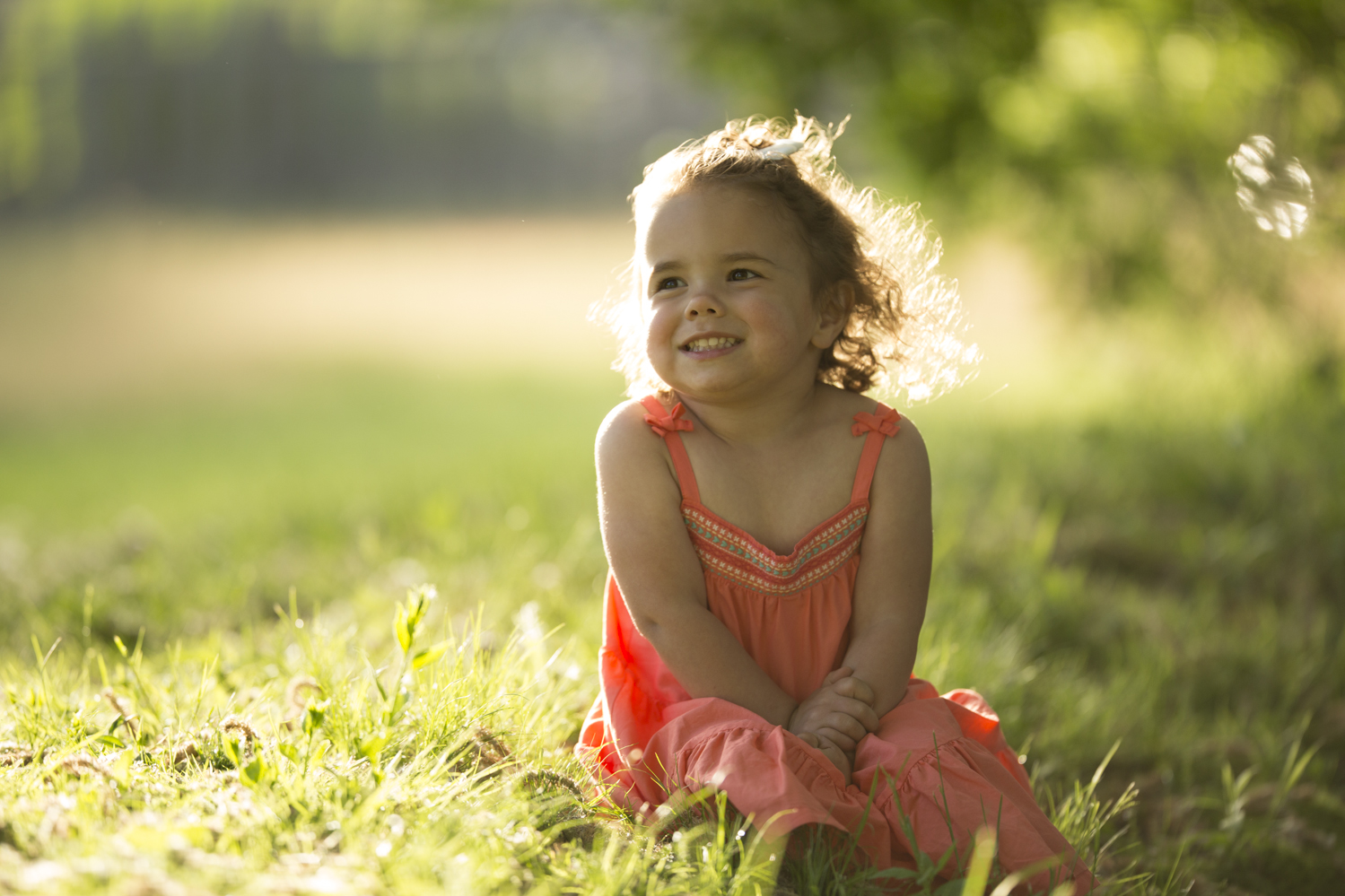
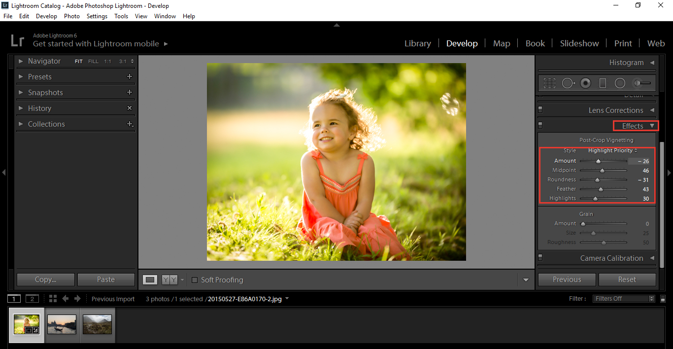
The Portrait
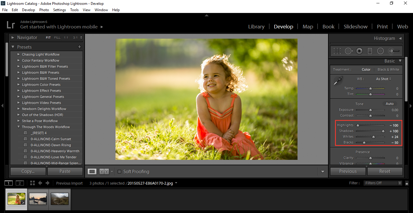
First, I go to my Basic Panel and turn the Highlights Down and my Shadows all the way up.
I minus my Blacks and Plus my whites, while holding Alt, so I will see a plain screen. When I start to see pixels coming through on my screen, is the point where I would want to stop.
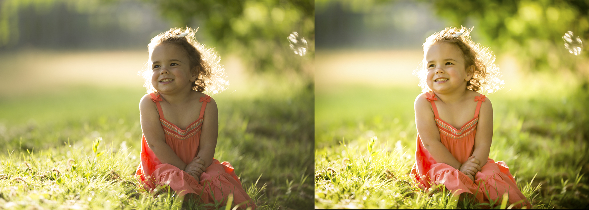
My image is already looking better.
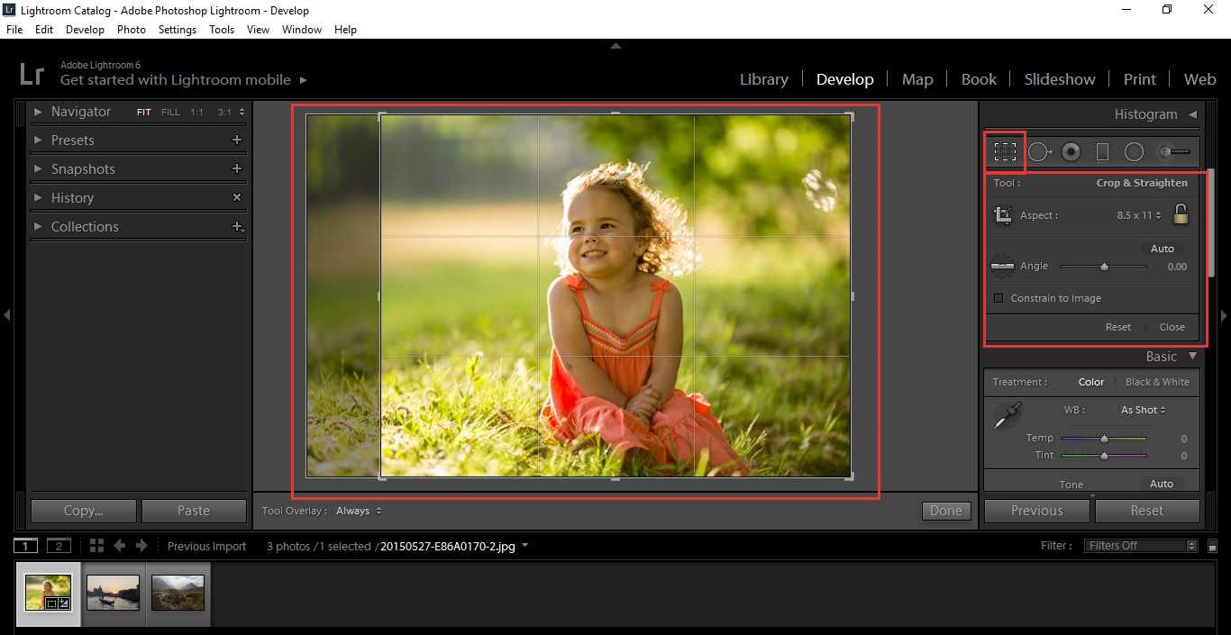
Then I’ll check on Cropping, to give the image more of a balance. My image here is heavier on the right-hand side, so I’ll want to center the little girl a bit more, to give balance to the overall composition.
Press (R) to activate your Cropping Tool.
You will see guides to help you do this, and if you press (O) it will flick through the various different options.
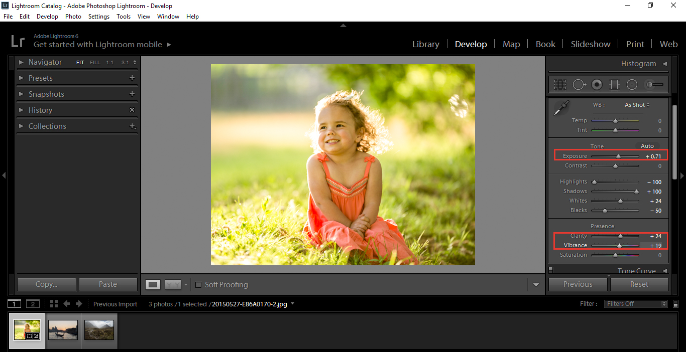
So, now I’m thinking, ok the image isn’t that bad but what could I do to further enhance this image and draw stronger, more defined colours out.
The answer is, I’m going to increase my exposure just a little bit more, but not too far. Be aware, so that you don’t lose out on some of the details in the light.
Then, I’m going to increase my Vibrance and Clarity until I’m happy with it. Sometimes I’ll play around, sliding from one extreme to the other so my eye adapts to the extreme changes, then I go with what feels good to me.
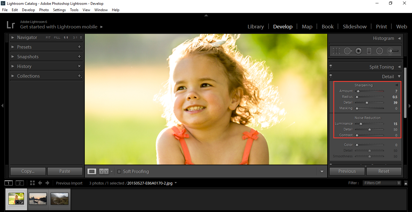
I want to find a balance between the two where I’m happy. If you Sharpen, it will increase the grainy texture to your image and Noise reduction will smooth out the image, which can give it a dreamy type effect in some cases. Finding the perfect balance will take a little bit of playing back and forth until you feel it is at its sweet spot. Stick to your gut with this one, when you feel it’s good and your happy, then that’s it.
A quick way to do it is to put your sharpening amount around 60-70 and your Luminance around 30-40 and that should do it just fine.
Then, I like to add a little bit of a Vignette, just to draw the viewers gaze more towards my subject.
Adding a little bit of drama with a Vignette to your image can work wonders.
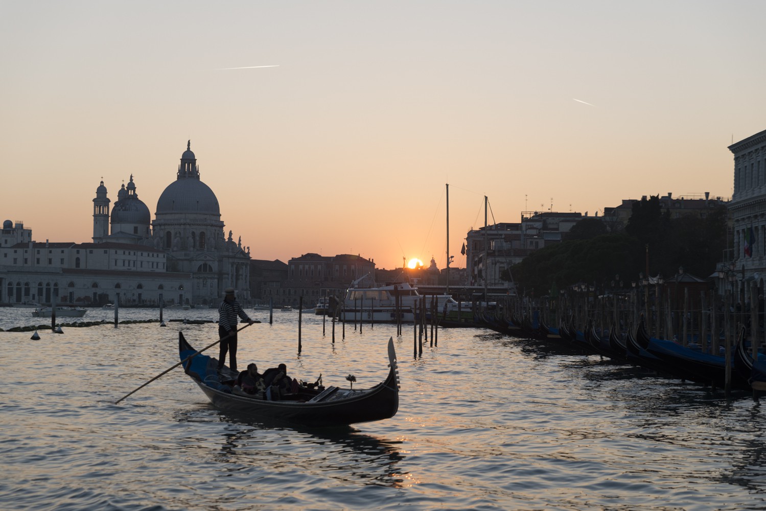
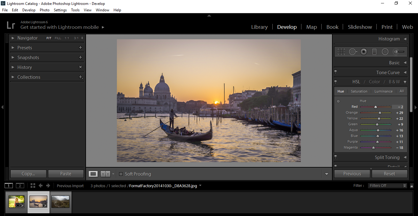
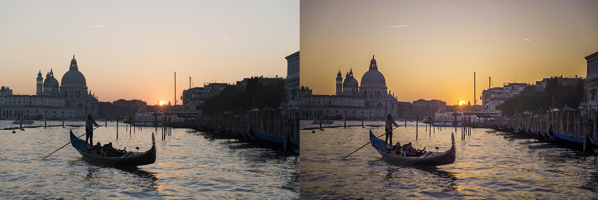
The Object
I would refer to this sort of image and something with like a building, boat or car, something non-organic.
So first, I’ll go through the standard process above, playing around to see what happens.
I’ll also pay particular attention to Sharpening and Noise Reduction.
Then, I’ll start to shift my focus more on the Colours. I will play with Tint and Temp in the Basic Panel to see if anything good comes out of it, but what I really want to look at is the HSL Panel, cycling through Hue Saturation and Luminance.
My thought process with this picture was that the Sun was going down and I wanted to keep the strength of the Sun but cool down everything else to give it a duality.
My tutorial on Split Toning is good for learning this if you want to have a quick look.
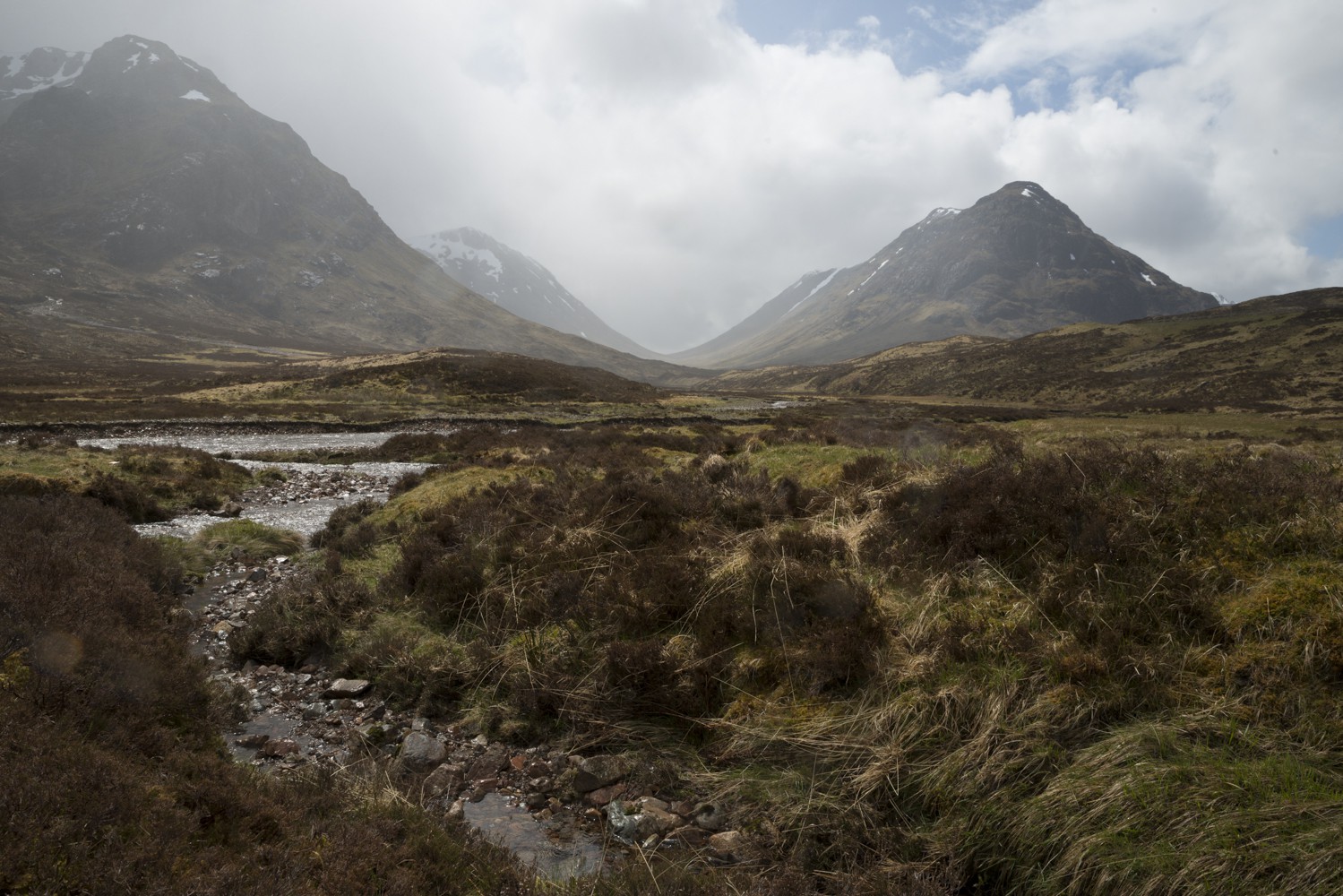
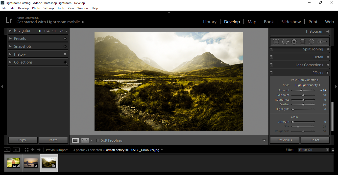
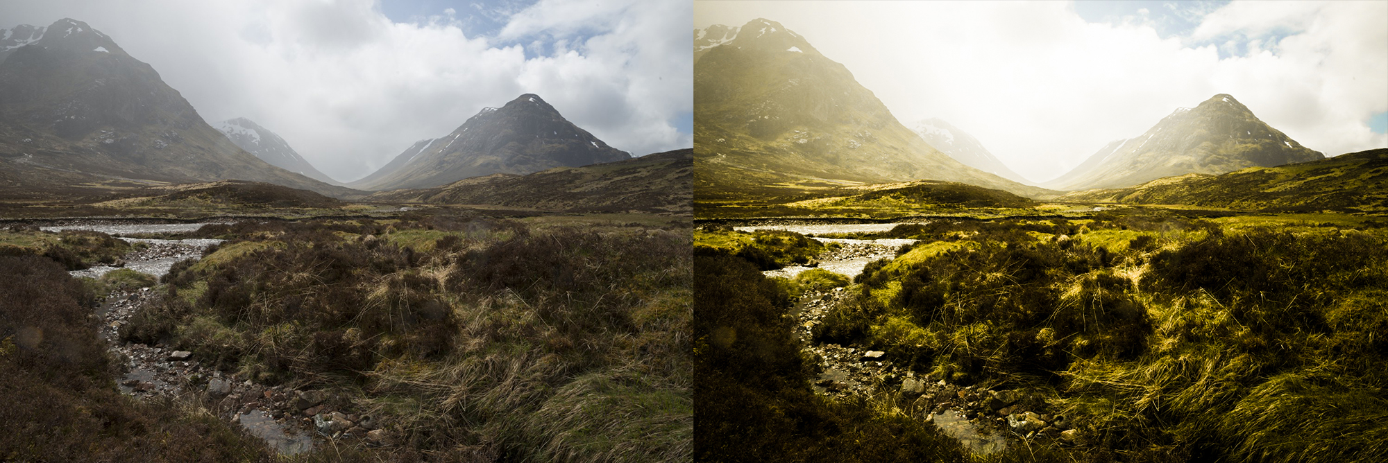
The Landscape
As above, I followed the same process, only for this one the Highlights and Shadows were adjusted the opposite way. I also used my Clarity a little more, and same with the Details Sharpening, to really bring out the grass in the forefront.
The reason the Highlights were moved the opposite way, was because I wanted to give the image the feeling like the sky was breaking over the mountains and breeding life back into the Landscape.
I added a little vignette to help this feeling, also your eyes are now more focused off into the distance between the mountain range.
That’s really my thought process when I’m developing, as you can see, it can be a back and forth trial and error process.
My suggestion is to take what I have given you here and play around, going from one extreme to the other. The Tools discussed in this tutorial cover a huge area, and you can do loads with them.
Our Presets are just variations using these tools, so you can see the advantage of using presets and avoid going through this massive trial and error process.
I hope you got a lot out of this and could see how my mind works during this process.
Graduated from college in 2002 with a degree in Art & Design, I started exploring my way in Graphic Design and Professional Post Production. Full-time freelancer since 2011.


 Facebook
 Google +
Comments (0)
There are no comments yet.